
.jpg)
Source: http: //www. hidabroot. org
The recent trend in modern web design emphasizes on simplicity yet with versatile and accessible content. Every site is trying to present its product in the most obvious manner possible, with over-exposure and overwhelming information. They are eventually buried among all the other hypertext messages, ending up with the visitor clicking off after a few brief glances. According to Sheena Iyengar’s “Jam Study”, it is suggested that when a being is offered too many options, the more difficult it becomes to make an actual choice. (View the Jam Study here)
It is essential that a web page’s display draws the user’s immediate attention to its key message. A user, with clear objectives on what he/she is looking for, is reluctant to take in too much information. In this case it is a good idea to simply allow the user to search by sorting categories, or typing keywords, as a means to pinpoint the target product. A user-friendly engine as such not only increases the site’s appeal, but also credibility.
In the following section, 3 cases will be discussed on how a product can be marketed in a choice-friendly fashion from the user perspective.
Example 1: Which option is better for recommended products
A. Recommended
B. Recommended
In terms of quantity, B has provided a wider range of product variety. However, if each item’s appeal is the same, from the view of selection cost, the cost for ten items is much higher then the cost for three. For users that are not familiar to the product, their judgments rely mostly on its visual support and product name. Therefore when recommending something new, one should reduce in quantity as to lower the time of the user’s hesitation brooding over products to select.
Example 2: Which option is better for product categories?
A. Categories
B. Categories
Although the soring of A has better logic, it gives no visual impact as to intrigue a browser to have a closer look. B not only keeps the theme-based category intact, but also amplifies on product priority. Visually speaking, it it much more clean-cut, and helps the user make more accurate decisions.
Example 3: Which option is more likely to be chosen based on its statistics?
A. Promotion

B. Promotion
When 2 similar products are shown side by side (as in A), the number of downloads ultimately decides the product of choice. Although it might be possible that the more downloaded product was launched earlier then the other, views still have the impression that the latter is less popular. If 2 neighboring products are not under the same classification (as in B), the downloads will not be that big of an indicator. When a user already knows what type of product he/she is aiming for, the statistic analysis will play a key role in decision-making, therefore it is better not to have recommendations with similar functions next to each other.
Conclusion:
To sum up, as the information available always out-numbers consumer’s preference, it is crucial that we are able to make initiative selections first. In order to become an efficient platform, the logic of web design must be user-oriented and in sync with the logic of average browsers. Using the right method of advertising in appropriate circumstances is the best way to catch a client’s eye.
Reference:
1. http: //www. theteamw. com
2. http: //www. youtube. com/watch? v=3J85SUZFXNM&feature=relmfu
3. http: //www. smashingmagazine. com/
Source:
5. http: //www. bigfishgames. com/
6. https: //play. google. com/store? hl=zh-TW&tab=X8
————————————————–
About the author
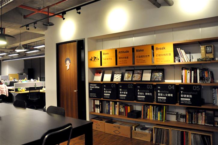
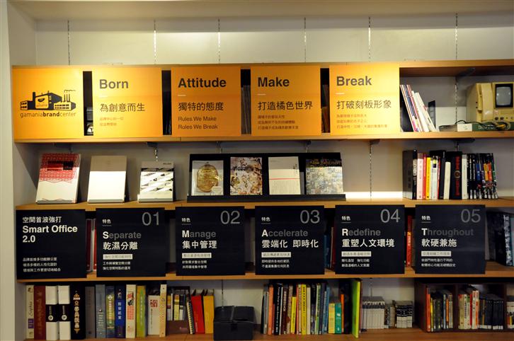
Gamania User-Experience Center / Celine Lin
By methods of User-Centered Design, this model is aimed to execute or modify all corporative projects as to improve and promote Gamania in-house user-oriented products.
————————————————–