

Born to play and to have fun, such is the strong brand character and culture of Gamania. Whether it is in space, sound, office stationary, everywhere you see you could feel the vibrant, vigorous energy of Gamania. GamaGarden was born in April, 2012, it is the brainchild of Gamania, inheriting Gamania’s style. The minute you step into GamaGarden, you could feel that strong element of play and fun!
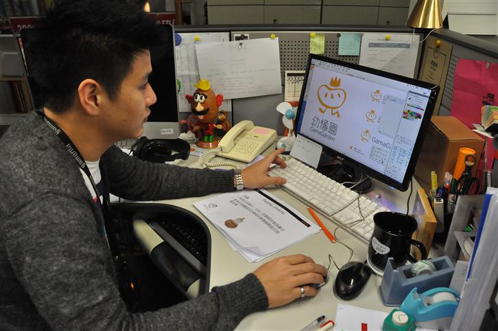
G!VOICE invited the planner, Rainbow and desiner, Kevin from Brand Center to talk about the brand concept of GamaGarden.
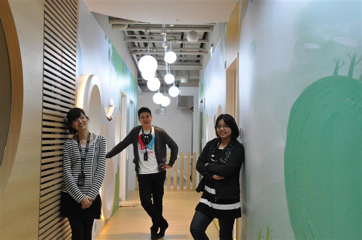
▲The design of GamaGarden’s brand image was planned and executed by Kevin (middle), Rainbow (right) and Emily (left).
Gamania + GamaGarden=FAMILY
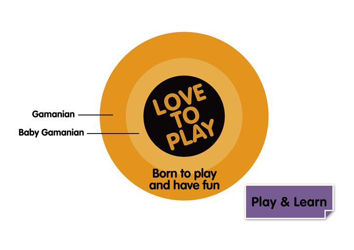
In terms of GamaGarden’s brand concept, Rainbow said, “GamaGarden and Gamania are like two concentric circles, the core idea is ‘born to play’. In other words, GamaGarden inherited the gene from Gamania. We hope that baby Gamanians could learn through play. And we also incorporated the concept of FAMILY which embodies Gamania’s spirit.” In designing GamaGarden’s CI image, we could clearly feel the vivid, playful elements.
As for the Chinese and English titles of GamaGarden, she said, “The Chinese name suggests that the kindergarten is like a fruit farm, providing baby Gamanians with the best resource and nutrient. Another reason is, similar to Gamania’s name, it sounds like ‘kindergarten’ in Taiwanese. The English name, GamaGarden is literally the combination of Gama+Garden. ”

Inspire Potential: Making Every Baby Gamanian the Prince/Princess in the Parents’ Hearts
GamaGarden’s logo and auxiliary graphics also have special meanings. Rainbow said, “Every baby Gamanian is the treasure in their parent’s heart. They are like colorful seeds. We hope that through inspiring teaching method, we could activate every baby Gamanian’s potential, allowing these seeds to sprout and becoming the prince/princess in their parents’ hearts.” In terms of the image design of identity card, Kevin said, “GamaGarden’s logo is expressed in crayon texture, which symbolizes kid’s innocence and sense of vividness as if they are kids’ drawings. In terms of the color, we adopted soft and bright colors to give that extra bit of child-like brightness and cuteness.” The presentation of auxiliary graphics was composed of many bright colored dialogue bubbles. Kevin said, “The use of dialogue bubbles is to emphasize children’s autonomy. We want the kids to tell us what they have in mind. ” Therefore, the design of class name was left blank for children to name their class and design their class sign on their own.
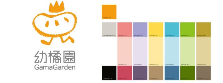
▲The logo and other color palettes bring out the innocent and vivid child-like feeling.
▲Kevin talked about the design of GamaGarden’s logo and that there are actually many hidden meanings underneath these design.
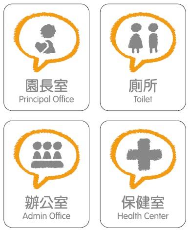
▲GamaGarden’s space indication system (left) adopted the crayon hand-drawn style which added some lovely child-like texture to it. The identification card (right) uses color to distinguish itself from other subsidiaries’. The white base tone symbolizes the innocent, pure image of the children.

▲The colorful dialogue bubble conveys the concept of ‘let the kid talk’. The image design of the front door of GamaGarden has a huge talk bubble on it.
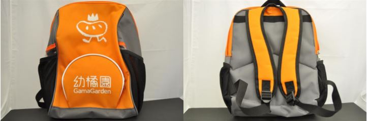
The style of GamaGarden’s school backpack was carefully selected. The multi-layered design enables children to put their water bottles. On the inside, there are also different layers for children to categorize and place things with ease. We also chose a dirt-proof, easy-to-clean fabric (which cost more to manufacture). The main color of the backpack is orange, an obvious color to enhance children’s safety.
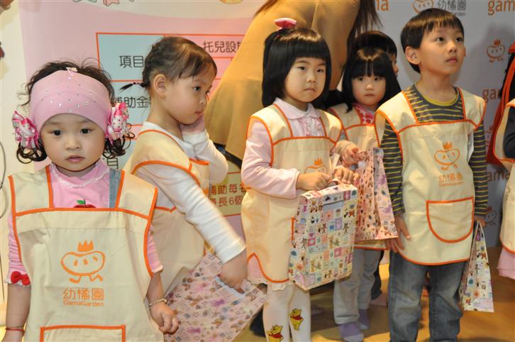
▲The teacher’s uniform has slight trim in waist-line and places to put pens in the pockets. Children’s uniforms incorporated the lively yellow to convey their lovely and innocent image.
Be Creative: ‘Mig Said’, Children Tell Their Own Stories
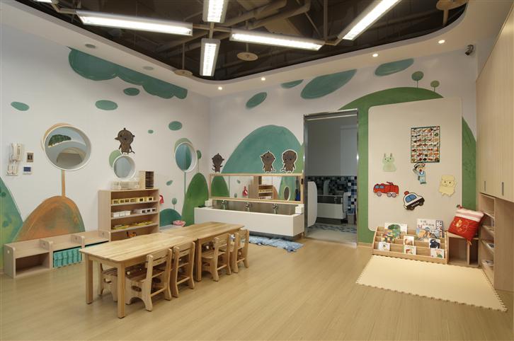
In terms of spatial arrangement and installation, GamaGarden incorporated Gamania’s original creation, Mig Said. The child-like hand-drawn style and warm color matches with GamaGarden’s brand image. We placed the characters from Mig Said in the GamaGarden—different animals for each level of class: Dodo mouse, the crab, square-head lion, and pink elephant. The adorable animals appear in every corner of GamaGarden. In order to let children tell their own stories, we put in steel panel design so that children could move around the magnets that secure the animal characters to the wall. So how the story goes from now on, depends on children’s creativity!
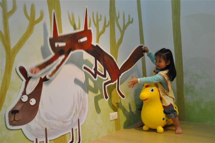
▲Children could change the places of the characters in Mig Said, tell their stories in their own ways.
After incorporated characters from Mig Said, the space in GamaGarden became more vivid and lovely.