When being asked to fill in our telephone number online, users sometimes have trouble entering or changing the numbers due to problematic formatting. The inconvenience can be avoided by more thorough and empathetic programming. In this article, Design Tongue shares useful coding skills for phone number formatting. First, let’s have a laught at some hilarious examples. Who says web designers don’t have a sense of humor?
Dropdown list: a test of eyesight and finger speed.

Validation: It takes a lot of luck to get it right!

Hand drawing: Only if I had the time…

Addition:(000) 000-0001 is marketable.

Dial-up: Very retro…

Basic phone number formatting methods
Domestic numbers usually combine area code(ex.07 for Kaosiung) and phone number. Separating the two fields is hardly confusing. International phone number input formats, on the other hand, are more complicated and confusing. Here are some of the common entering formats:
Country code + area code (0 should be omitted for some countries)+phone number
ex:+886 7 123 4567
Country code + cellphone numbers(0 should be omitted for some countries)
ex:+886 910 123456
In Taiwan, area codes are 2 or 3 digits and phone numbers are 7 or 8 digits. For example, 035 is the area code for Hsinchu area and 07 is for Kaosiung area.
Input Field Formats
Single and multiple fields are the most common methods to capture user inputs. Both methods have their pros and cons.
Single Field Format
A single field is placed after a description or an icon. This is the most common pattern, which requires less coding and less taps. However, long phone numbers may be difficult to read and users would not know if area codes or country codes are required.

Multiple Fields Format
Multiple fields format breaks the number into specific fields. For example, three separate fields are made for entering country code(+886), area code(022) and phone number(111111). With clear instructions, user errors can be largely reduced. However, Different digit numbers from different countries make it difficult to control phone number formats. Users cannot do copy-and-paste.

Elegant Solution
Design Tongue prefers single field format for its simplicity, but adding some useful details can enhance user experience.
1. Field masking
1.1 Field Name
It’s needless to say that field names are essential. Adding a small icon makes the interface more fun and enhances brand awareness.
1.2 Input format correction
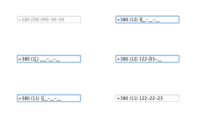


▲ To avoid transcription errors, phone numbers will automatically be placed in the correct format.
#、x、ext are used for extension numbers.

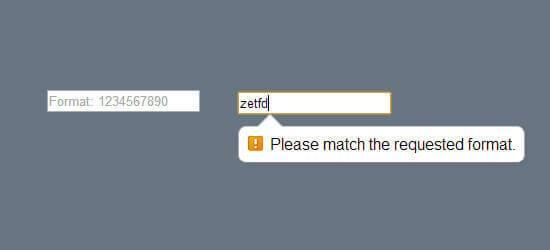
1.3 Error detection
Automatically detects errors when users do not use numeric digits or the correct numbers of digits.
Dropdown list
It can be frustrating to enter country codes on international websites. Knowing that only numbers are accepted in input fields, users often get confused whether they should use the plus sign. Those who have gotten used to it may forget that it is not needed to dialing, theose who seldom make international calls simply get confused. Without proper indications, users often have to open another window to check the correct country code, which is even more time-consuming on mobile devices.
Using a dropdown list is much more time-efficient. However, with a large number of countries displayed, special UI approaches can make choosing country codes easier.
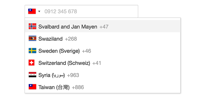
1. Flag dropdown: Many designers find flags useless due to their small sizes, I believe they still hold functional and aesthetic values. Flag icons can also help users can quickly scan through the list.
2. Country names in English: English is the international language that is easy to be searched in alphabetical order.
3. Country name: Most users recognize the name of their own countries more quickly.
4. Country codes.
After choosing the country code, the entered data will be automatically placed with the right format. ( DEMO https://goo.gl/cxr8cx)。
2-1 Prioritizing frequently used country codes
Users may go insane if they have to choose from more than 200 countries! A more friendly approach would be prioritizing the most frequently used country codes. IP address also helps detecting country codes.
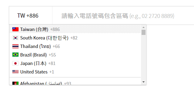
▲Try here=> whoscall https://whoscall.com/zh-TW/
2-2 Enquiring country codes
Adding search function adds efficiency to the dropdown list format. Designers should provide a mechanism that allows users to search for both country name and country code by typing names or numbers. This searching method is more intuitive and user-friendly. It’s the programmer’s job to do keyword matching and fuzzy search.

The search function is useful when users remember only parts of the country code and country name. But if users search with only the first letter(b for Brazil), the mechanism would show all data containing the letter(Albania).
If difficulty in programming is not a concern, the best thing to od is to offer search functions for both country name and country code. When a letter or a number is entered, matching country names are listed in order of relevance.
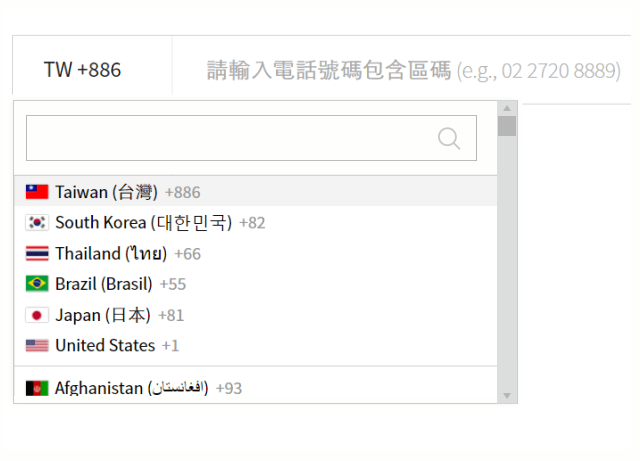
▲ Modify whoscall elements
3. Input mask
Zero is omitted when dialing international number on a cellphone, which is often forgotten. Reminders are oftern ignored by users. The best way is to accept numbers with or without 0 in the front-end and change them in the back-end .
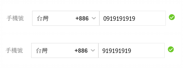
4. Different options for registraion
Most service platforms offer online registrations on mobile devices. To make authentication process easier, it has become popular to use phone number as account name. Depending on company policies, users without cellphone numbers ot local numbers may not be able to register successfully. We suggest using e-mail address or user name as account name. We can also bing users’ registered phone numbers with their email addresses.
5. Making numbers the only input option for mobile devices
Entering date on mobile devices is inconvenient. Default setting should be made to simplify the action. The setting is techically supported.
Reference- 01 https://goo.gl/OzU1Y6 (different mobile input types)
Reference- 02 https://goo.gl/pWpqYc (different mobile input types)
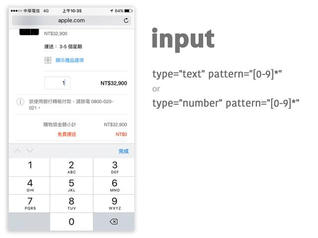
▲ When inputting numbers, number 0 to 9 are used.
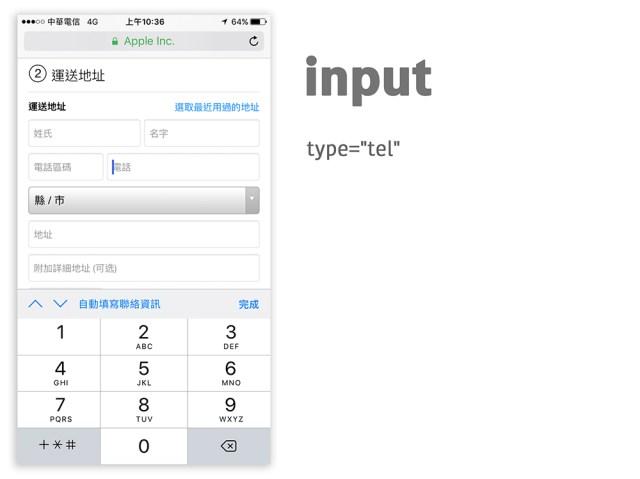
▲ When inputting phone numbers, signs(+ * #) can be added.
Conclusion
Is it worth the investment for companies to modify a simple input field? Design Tongue agrees that building important infrastructures is more important during the initial stage, but well-designed details can set your products apart. This article introduces methods based on user experience. Issues regarding programming have not been further discussed. Please do not hesitate to offer your precious opinions in the forum!
Reference:
friendly format for Phone Numbers (https://goo.gl/Dlm3hb)
Multiple vs single field capture for phone number form input (https://goo.gl/8O9EVS)
Phone number Entry question (https://goo.gl/Wa1u8i)
E.123 formats (https://goo.gl/9d9ppZ)
If Satan was a web developer … (https://goo.gl/0wKjnA)
