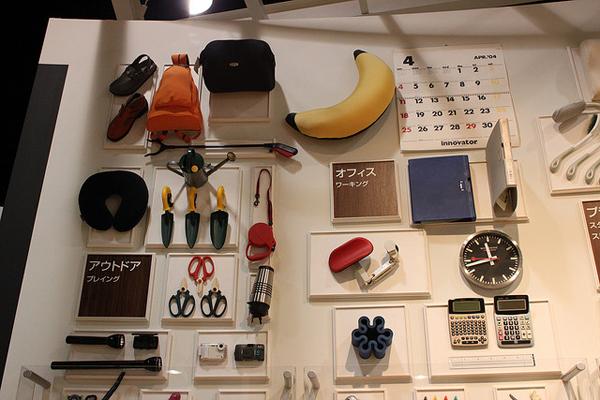
A good design will enable people to have a better quality life! Taipei World Design Expo 2011 was held inside the Nangang Exhibition Hall. Have you noticed there is a room called, ‘Universal Design’ exhibiting various things from everyday utility to futures and billboards? The concept of universal design is based on ‘humanity’, the products should be easy and convenient to use for the healthy, senile or physically/mentally challenged people.
This multi-functional opener adopts the principle of physics and is suitable for female or seniors who might have trouble opening drinks. With this opener, you can easily open any drinks, be it bottles or cans. Its protrudent triangle design is perfect for opening ring-pull cans. Women with exquisite nail polish don’t need to worry about breaking the nails or spoil the paint. You can open as many as you want.
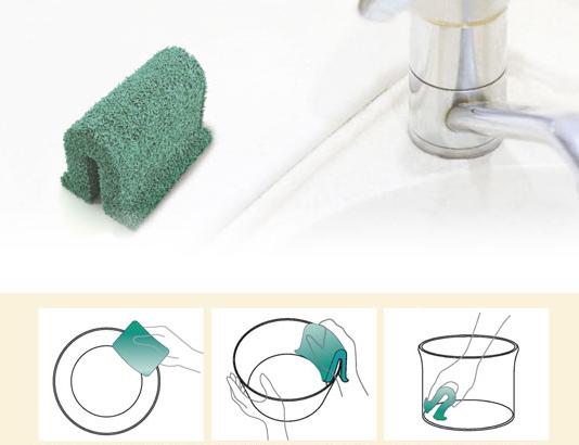
Another interesting merchandise is the U-shape Sponge which won the first prize of universal design award. Don’t underes timate this tinny scrub sponge, the designer took into consideration that soaked scrub sponge is usually difficult to dry up and may cause germs breeding, therefore a 1cm U shape space was hollowed inside the sponge. This way, the users can intuitively use the sponge to clean the rims or the backs of pots and pans. After the dishes are cleaned, the sponge can stand alone on the side or on the rack in the kitchen.
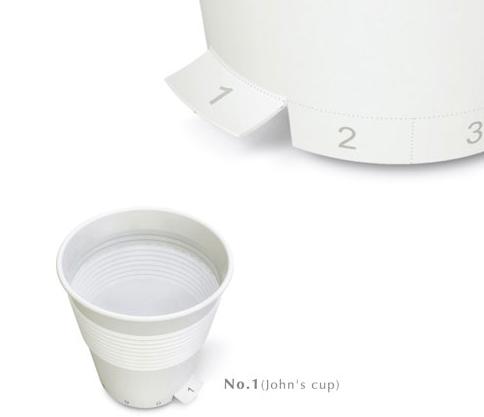
Have you had the experience when you are at a party, you can’t tell whose (disposable) cup is this? This ‘Who’s Cup’ design adopted the bendable feature of the papers and printed the numbers at the bottom rim of the cup. A guest could pick a number and bend it upwards, and hence solve the confusion or unnecessary waste at the party.
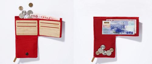
Another common scenario people often encounter is having been able to sort out bills and change after purchase. The product is a wallet that helps you ‘categorize’ bills and change. All you need to do is to put the given bills and change inside the wallet, the change will automatically roll down to the little pocket underneath. When next time you need to use the change, just open the zipper from the other side of the wallet. Very convenient, isn’t it?
There are 7 principles in universal design, if your design fits more than 3, it can be considered a universal design.
Basic Principles of Universal Design:
1. Fair use: the design can be used by different users. It is best to avoid excluding certain groups and try to make the design visually comprehensive.
2. Flexible use: consider different habits by different users, provide various options in application and methods.
3. Easy and intuitive use: be able to fit users’ expectation and be used intuitively. The design should be able to provide effective prompts or feedbacks during the usage.
4. Obvious information: use various communication such as pictures, voices, touch to convey necessary information, maximize the ‘identifiability’ of such information.
5. Allowing room for mistakes: a good product design should minimize potential mistakes generated through accidents. When mistake or danger occurs, warning measures should be activated or provide recoverability.
6. Labor-saving: the design can be used effectively, comfortably and effortlessly.
7. Proper size and room for usage: the design can provide suitable size and room for operation and usage regardless of users’ body types, postures or mobility.
Summary:
We can say that the real universal design is to ‘satisfy the majority, not the minority’. These extra bits of design details make the life easier for different types of people. When we use the product, we enjoy the convenience and the experience. Through close collaboration between engineers and designers, the products become more user-friendly. Practicality is the key to people spreading the words. The spirit of universal design lies in taking care the most people and watching smiles people put on after using the product.
Reference:
1.http://www.boco.com.tw/
2.http://www.ud.org.tw/web/index.php
3.http://www.ap.buffalo.edu/idea/Home/index.asp
4.http://blog.yam.com/user/yocofish.html
————-
About Author
Gamania UI Designer Center / Celine Line
Adopting a User-Center Design approach, the Center seeks to improve upon Group initiated projects to promote Gamania self-produced products and give the players the best user experience.
————–
