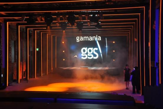
As the saying goes, “clothes make the man”. While the focus is on the games, the design of the exhibition area was an important part of the GGS as well. The pavilions at GGS were the work of well-know theatrical design company “Big Bright Room”. Thanks to their ingenuity, each of the pavilions acquired their own particular style and became the center of the media’s attention on opening day. The main pavilion even included movable sofas that could be used to host press conferences during the day and parties at night! So what was Big Bright Room’s design concept for the GGS? What special features did they design for each of the pavilions? Find out with G!VOICE!
Unique Pavilions!
The GGS consisted of five main parts: the Main Pavilion, the Core Blaze pavilion, the Langrisser Schwarz pavilion, the Dream Drops pavilion and the Tiara Concerto pavilion.
Main Pavilion
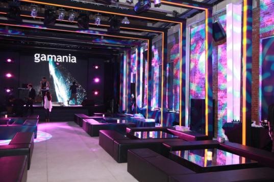
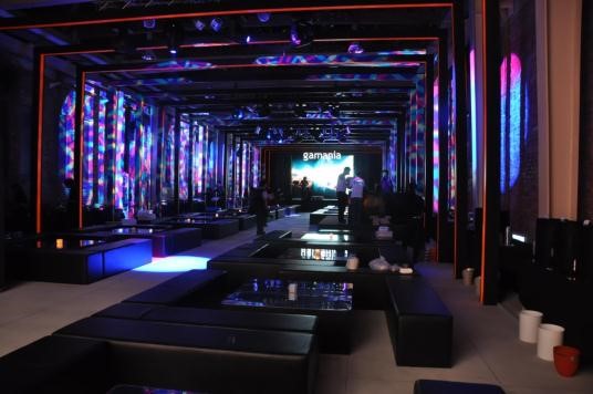
On the first day the Main Pavilion had a staggered layout with a mobile stage and TV wall at the front. As the day progressed, many members of the media were amazed by the design of the mobile stage. On the first night, the Main Pavilion was transformed into a nightclub-style layout. The fast-pounding electronic music at the GGS Party allowed reporters to get down and relax after a long day.
Core Blaze Pavilion
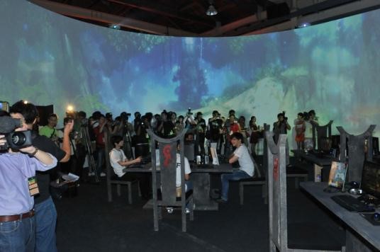
The Core Blaze pavilion was designed as a 360-degree capsule, allowing the development team to give their in-game video presentations to the audience as immersive 3D surround projections.
Langrisser Schwarz Pavilion
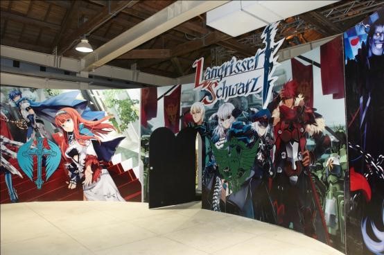
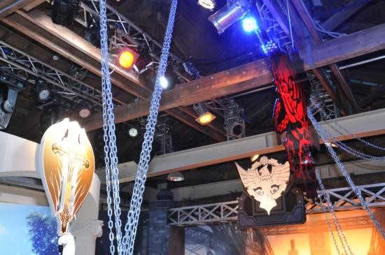
The Langrisser Schwarz pavilion featured a layered design. The goddess statue at the entrance asked visitors questions before guiding them into the pavilion proper. A door then separated the primary and secondary exhibition areas, followed by a demo area divided into three parts. Each part was fitted out in the unique style of one of the in-game factions. The actual pavilion itself was not particularly large but the design helped to reinforce the idea of the three feuding factions within the game.
Dream Drops Pavilion
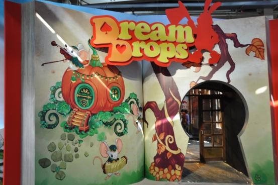
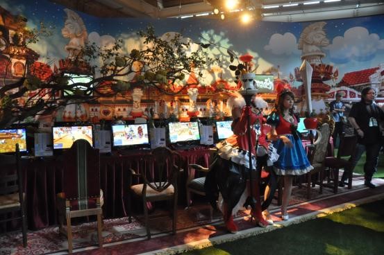
The Dream Drops pavilion featured a keyhole-shaped doorway. Inside, visitors can see a real-world version of an in-game setting based on the “Mad Hatter’s Tea Party”. A long table laden with all kinds of tea ware along with bizarre flowers, plants and trees gave the pavilion a fairy tale-like atmosphere.
Tiara Concerto Pavilion
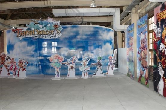
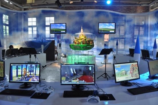
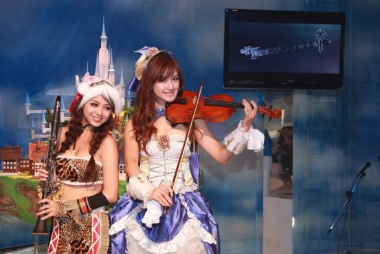
The exterior of the Tiara Concerto pavilion was made up of white gauze painted with white clouds on a blue background to convey the game’s “sky” theme. The center of the pavilion featured a very detailed floating castle model as well. Once the GGS got under way, cosers gave live musical performances as well so visitors felt as if they were walking among the clouds and looking at a floating city in the far distance.
Ingenuity, Fusion and Design – Interview with Big Bright Room’s Creative Director Huang I-Jun
Despite the hectic pace of the GGS, G!VOICE still managed to squeeze in a lunchtime interview with Huang I-Jun, the Creative Director of Big Bright Room. What kind of creative thinking went into designing all these distinctive pavilions? Keep reading and find out!
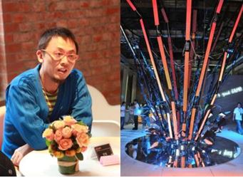
G!VOICE: There is a metal installation shaped like an explosion at the entrance to the Main Pavilion. What is the installation supposed to convey?
I-Jun: Ting Hung had told us that the core concept for GGS was to be “Explosion”. We wanted to create a main visual motif as well so decided to use towering LED lights to express the whole “Explosion” concept.
G!VOICE: Most of Big Bright Room’s commissions in the past was for wine or jewelry exhibitions. As these don’t seem to have much in common with a game show, were there any problems or difficulties during design?
I-Jun: The main difficulty I think was the fact that I knew nothing about games. Still, this project showed me just how complex game worlds can be. A game is basically a virtual world. Since my background is in theatrical design, it was interesting to discover that a game show is filled with its own worlds and stories just like theater and film.
G!VOICE: The emphasis at Big Bright Room is on a dramatic design. How was this realized in GGS?

I-Jun: We did our best to learn about the content of each game when we started our design work in order to define the setting and ambience for each pavilion. Take Core Blaze pavilion for example. We didn’t want to use the usual booth designs for game shows so we came up with a capsule-style pavilion that gave the audience an immersive experience. For the Langrisser Schwarz pavilion, we used the classic goddess questions as the starting point. From there, the visitor moved gradually deeper into the story and then into heart of the conflict between three factions. Due to the venue constraints, Dream Drops and Tiara Concerto shared the same hall. On the other hand, this gave visitors a chance to decide which way they want to go from the entrance. It’s worth mentioning that the curtains at the entrance for Tiara Concerto were painted by an old craftsman who is practically a living treasure to achieve that fluffy and insubstantial look. Nearly all of the furnishings in Dream Drops were antiques as well and included a book that was more than a hundred years old.
These are all real antiques!

▲Gama Island was transplanted to GGS to provide everyone with a place to rest and relax.
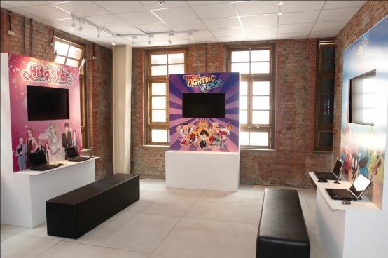
▲In addition to the four themed pavilions, there was also a General Pavilion for the SNS, mobile and web games.
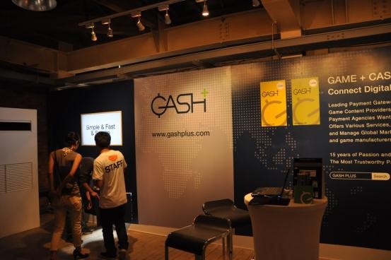
▲The GGS included a GASH card exhibit.

▲The Mobile Game exhibit area featured many smart phones for player demos.
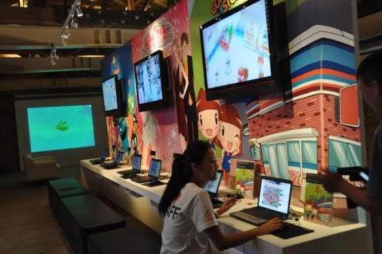
▲The SNS Game exhibit came with many demo computers as well.
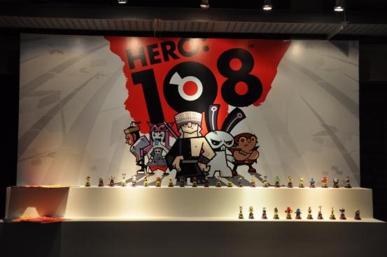
▲The Hero: 108 figurines had a very impressive exhibit of their own.
