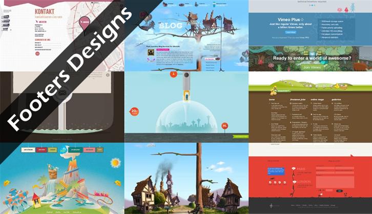
Before I get into the subject, I’d like to begin with a slogan from Nokia’s commercial, “Hunan Technology”. Through the design of emotion, a life-less product is given a friendly feeling, no longer a cold product or webpage. In fact, in the process of design, it does not always come from a brand new concept, on the contrary, we seek for something that is already rooted in people’s subconsciousness. I believe no one has ever taken a serious look at the footer on the webpage. Footer design is the most easily ignored or underestimated part of the webpage design. You may think the header is the focal point of the web-design so you put in all the efforts in creating an enticing header and content. Perhaps you think you just need to put a conventional copyright statement and disclaimer on the footer and the work is done. But have you thought about what the viewers may think when they see the footer at the bottom?
Footer is not only a big space to fill in texts. In the webpage design, you could use it to incorporate some interesting ideas, including sitemap, Twitter, new message etc. Let me introduce some impressive footer designs for you.
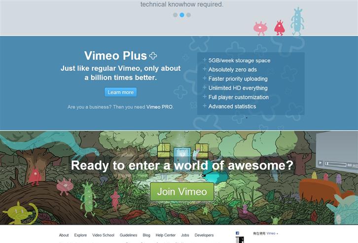
VIMEO:This is a very cool footer even though it does not contain much information. It mainly hopes for user to join Vimeo. The footer here is presented through beautiful illustration.
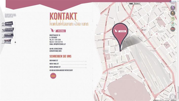
Putzengel:Through beautiful veins and various visual effects corresponding to the movement of the mouse, this footer shows consistency on the screen, from the map of the company, About Us, to Contact Us.
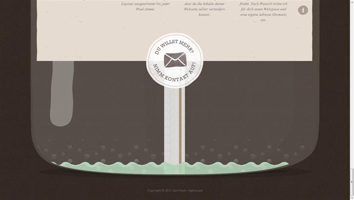
Jan Ploch:This is a piece from an awesome individual website. The footer design is an extension from the website design: a wine bottle. The footer becomes the ‘sticker’ that says Contact Us and the effect of the water nearly drained is also very interesting. The consistent design extends from header to footer.
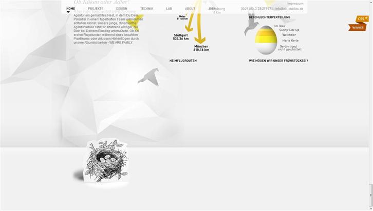
Ok Studios:The whole website adopts mixed animation from the top and bottom layers combined with different visual effects when the viewer moves the mouse. Footer is presented in clever illustration of black & white animal pictures.
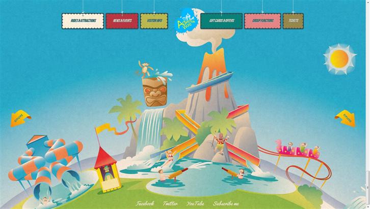
Adventure World:An exciting adventure world. It starts with the Earth as footer, when you click on the button, the webpage would extend upwards to show more scenes. This is a very special website that cleverly uses footer as the content in the main page and as the setting.
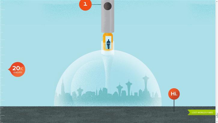
Atlantis:Searching for the lost Atlantis continent in 1962, you sit on a capsule and explore on the ocean floor until you reach the footer.
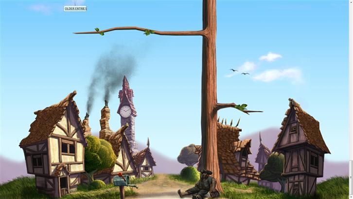
The Pixel:Another intriguing blog footer. Your view moves downwards from the top all the way to the bottom until you realize that this is actually a tree and there is a village next to it.
Conclusion
Footer design is a multifunctional area for webpage designers to show off their exceptional skills and to use their ideas to enhance the visual design of the website. In this article, we’ve seen the creativity of the designers through various footer designs. The purpose of footer is for users to find us in an easier and friendlier way. We hope that the footer design could provide them with additional experience and improve user experience.
Footer has transformed from a simple part of a webpage to carrying multiple functions such as copyright message, additional links, and Twitter updates etc.
Reference:
http://www.flashuser.net/inspiration/
http://www.flashuser.net/web-design/
http://philsu.tw/index.php/deisgn-treasures/
http://www.wowlavie.com/
———————————————————————————–
Adopting a User-Center Design approach, the Center seeks to improve upon Group initiated projects to promote Gamania self-produced products and give the players the best user experience.
———————————————————————————–
