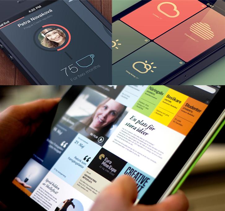
With the popularization of mobile devices, you see people toying with their smartphones or tablets during meetings, lunch, watching TV, on the MRT. No matter if you are playing games, reading the news or just surfing the net, these things have already become a crucial part of living. Hence the implosion of apps in the current market. There are so many of them, some realistic, and others simplistic. A design that blossoms out of such context, that apparently adapts best to the clean-cut, fast-paced logic of mobile apps, is Flat Design.
What is Flat Design?
In simple word, it means to abandon all those shadows, planes, blends, illuminations and other visual effects, as a means to make an UI look more simple. The spirit 20th century modern architecture is minimalism. This trend started up with slogans such as “Form follows Function” and “Less is More”, until it reached to the point it is today. When Michaelangelo was asked how he created the Statue of David, he replied: “Simple. I just kept what I needed and dribbled out the rest.” The same logic applies to UI design, too.
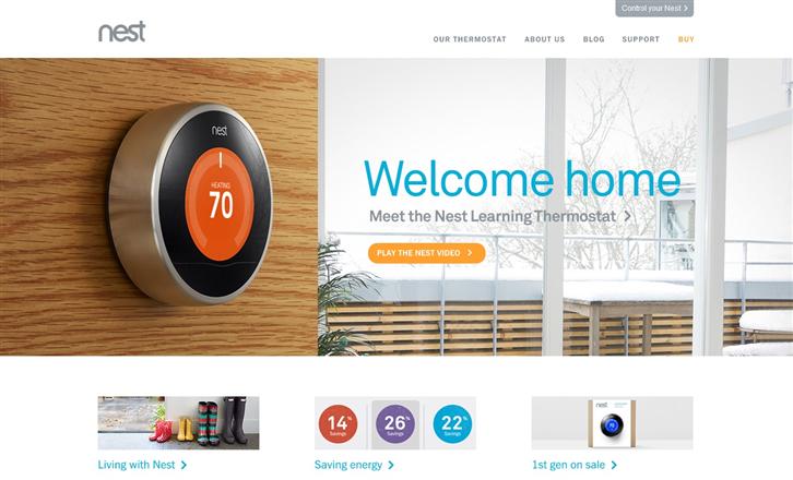
The internationally famous thermometer, NEST, was designed by the creator of Apple’s iPod. We can discover by taking a tour on their site that they truly base their product function on everyday needs. The style of simplicity, and its implication of being efficient, meets the taste and values of the modern mindset without much ado.

▲Metro UI
Metro UI is a style introduced by Windows 8, based on the principles of Swiss platform design. Its vibrant colors and clean display is quite similar to that of Flat Design. Moreover, they both emphasize the idea of “Content over Form”, as to actualize the concept of “Less is More”.
Flat Design VS Realistic Design
The classic Apple products take an appeal a style known as Skeuomorphism. No matter their memos, calendars or iBook, each is designed to be realistic and luxurious. Steve Jobs had also promoted this as a means to connect convention to modernity.
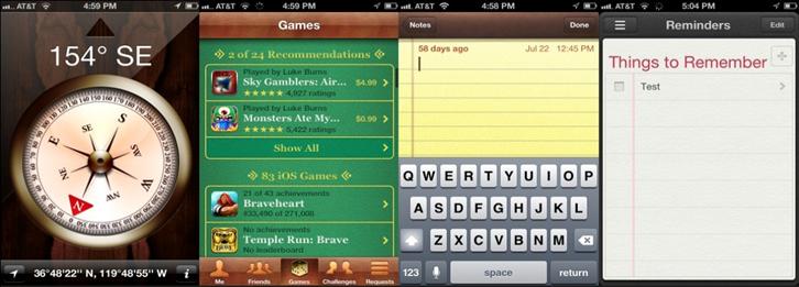
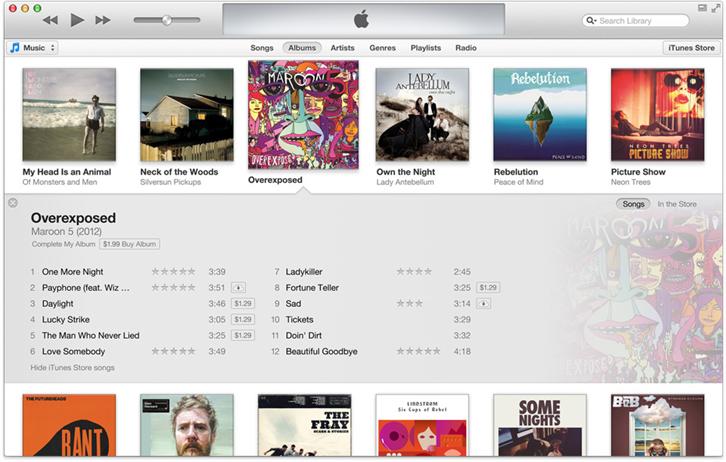
However, other group of designers at Apple believe that being too realistic would frazzle the user and complicate a products functionality. Jonathan Ive, a forerunner of this belief, than took the iTunes app in the other way and to the extreme: To simplify it as much as possible.
The value of design cannot be determined simply on its aesthetics
Whether it is Flat Design, or Skeuomorphic Design, the deciding factor always comes down to functionality. What is more important is how it is used, and how it is experienced, rather than just how real or how edgy it looks. Any style, for that matter, needs to go along the following basics of a good design:
Unity: A line of products need to have something collective and in common, no matter if it is color, icon, size, or logic: The user need to be able to experience all through experience one, and understand what the products present as an whole.
Categorization: In UI design, it is more about the core applications, and not that much about display. In order to be more convenient for the user, a neat and logical categorization of buttons is a top priority.
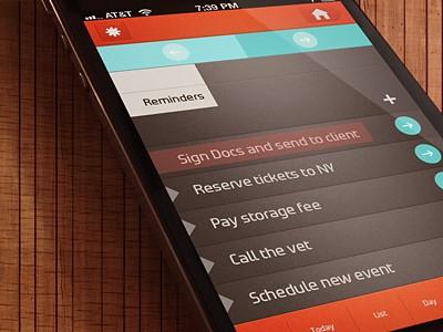
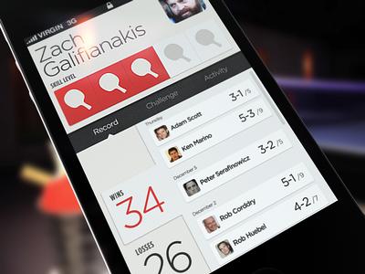
System feedback: A user would like some kind of indication that a command is put through, or when a undergoing procedure is done. In order to do so, clear sound or icon indicators in an important factor that would raise satisfaction.
Lower Risks of Conflict: No matter how lavish or unique a design may be, the concept needs to be simple. Lower the risk of confusion for the user is essential to develop the willingness of using an application. Any ambiguity on the part of panel display is a great risk for produce designs.
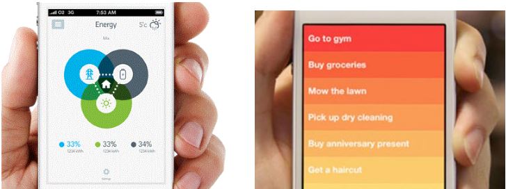
————————————————–
About the author
Gamania User-Experience Center / Jason Hsieh
By methods of User-Centered Design, this model is aimed to execute or modify all corporative projects as to improve and promote Gamania in-house user-oriented products.
————————————————–
