Our everyday life is filled with all kinds of signs. They transcend ethnicity, languages and nations. Through the design of icons and signs we could illustrate people, things and items to swiftly and effectively identify and communicate with one another.
Semiotics is a field of study on signs, symbols and the interpretation of their use. It mainly investigates how signs can be understood by people more easily.
Why should UI icon be simplified to signs?

The picture on the far left is an actual picture of a person’s face, on the far right is a conceptual face expressed through an icon. In UI design, we usually want to convey a functional idea or concept. The far left picture includes too much information which can easily distract us from the function we aim to serve.

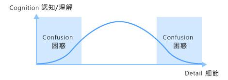
On the contract, if the detail on the face is simplified to a circle, it would also fails to deliver an accurate information and subsequently causes confusion.

In sign design, the icons that confuse the users usually have too much or too little detail. Therefore, you need to understand what kind of detail that can help users to identify and symbolize these icons in design to convey the message accurately.
How symbols were created?
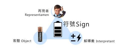
Signs are composed of three parts: 1. Representamen (designers who design the icon), 2. object and 3. Interpretant (object’s abstract concept).The sign is produced through designer’s thinking process. Let’s take the following battery as an example (see below). The battery is composed of these three parts, after simplifying the object to a sign, the designer created the common battery sign we know of.

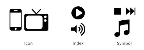
Semiotists thinkg that signs can be categorized into three types:
Icon : graph that looks like the object
Index : sign is the object itself or an physical association to the object
Symbol : the relationship between the mark and the object it infers to is a routine, rule or arrangement.

Graphic design includes the following key points.
In the UI world, effective icons must contain the feature of ‘immediate identifiability’. However, not everything could be easily turned into an icon. The designer must gradually rid of the details and conceptualize the icon and he/she also needs to consider the consistency when applying multiple icons on the same UI. Below are some principles you need to take into considerations before designing UI icons:
- Immediacy—effective icon must be recognized with one look
- Generality—which means an icon that prevails in representing something
- Cohesiveness—icons rarely stand alone. One must consider the whole visual presentation of the system while keeping the visual feature of single icon so that users can identify easily
- Feature description—when a user looks at the icon, it will conjure the features of the object in his/her mind and subsequently associate with the object.
- Communicability—the meaning of the signs should relate to users’ life experiences. When both parties are clear about their semiotic relationship, icons may facilitate effective communication.
Icon design may change with time and user recognition
Icon design may change due to real life changes or the psychological recognition of the users. For example, the original iTune icon consists of a disk and musical note, however in 2010, iTune changed its sign to a circle base with a simple musical note. The change was made because in current user habit, disk cannot fully represent its meaning anymore, so they altered it.

Iconized user preface has received more and more attention. It is only when designers enhance the identifiability and interactive feature of the icons, can they successfully set in tune with the users, making the icons easy to use and creating feel-good user experience.
—————————————————————————————————————-
Reference links:
http://uxmag.com/articles/realism-in-ui-design
http://cdc.tencent.com/?p=5038
————————————————–
About Author
Gamania UI Designer Center / MOMO
Adopting a User-Center Design approach, the Center seeks to improve upon Group initiated projects to promote Gamania self-produced products and give the players the best user experience.
————————————————–
