I don’t want to talk to machines—a surprising way of speaking to users
Some sudden situations we may run into when we go online, in addition to internet disconnect, computer breaks down, the most frequently encountered instance is ‘system message’. There are tons of system messages, some reminds you that you’ve selected the capital lock, some tells you your internet has been disconnected, some informs you the user name is not available. Most of the time, these messages are rigid, but the following message should bring a smile to your face:

▲“we have to check if you’re human.”
This message is shown after you’ve entered your user name or passwords wrong for the 3rd time. Isn’t it cute? After reading such cute note, even if the problem may be the system, it seems forgivable all of the sudden.
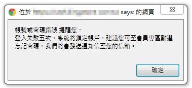
Now let’s take a look at the message that makes people frown.

Oops, you entered the wrong user name or password and the box popped out, telling you all these messages! It gives you a headache trying to remember the password already, after reading these words, I think no one wants to re-login again. If you try to read it through, you’ll realize there is too much information and steps in the description. After you close the information window, there is no way you can remember all that, so in fact it is not helpful to the users!
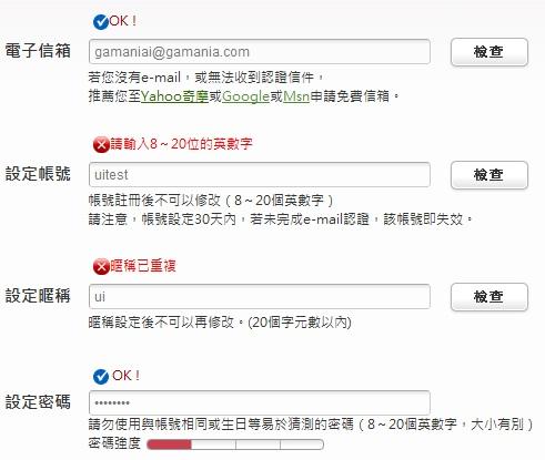
Another common system message is the checking message box you see when you are registering for membership. The systme will check the validity of your user name and how strong your password is, or tell you that you must receive verification letter etc.

In the registration page full of text where too much description under each key-in box, you even have to click the ‘check’ button on the right after you finish entering. Isn’t that just tire you out? What makes it worse is that most users don’t really read those messages! In fact, there are better ways to approach users. We don’t have to inform users their current status by stiff and fixed word boxes, but lively vocabularies.

Use “User name looks great” to replace “this user name can be used”; “Perfect password” to replace “Password strength: strong, middle, weak”. The content of the message has to be something that the user understands! In addition, user friendly words will make the experience whole world different and even create the atmosphere that the website is sensitive and knows you the best. It give people lasting impression.
No one likes to talk to the cold machines. Some website may suit this kind of ‘cool’ style but with the age range of online users expanding from elementary school students to seniors (some may say even their pets), how could we not cater to their preference (not including pets!). We should seek to make their experience online more smoothly and satisfying, with no worries whatsoever on the complicated system messages. How do we convey our messages appropriately?
Basic elements to consider when conveying a message:
1. Be concise: convey the meaning within 30 words, don’t use unnecessary words.
2. Be simple: don’t use too many technical words and don’t elaborate on every detail. Most users don’t really read them anyway!
3. Be friendly: use ‘you’ to address the user so as to close the distance, make them feel safe and happy.
4.To the point: put the most important message within the first two words of the sentence so people can quickly grasp what the main idea is.
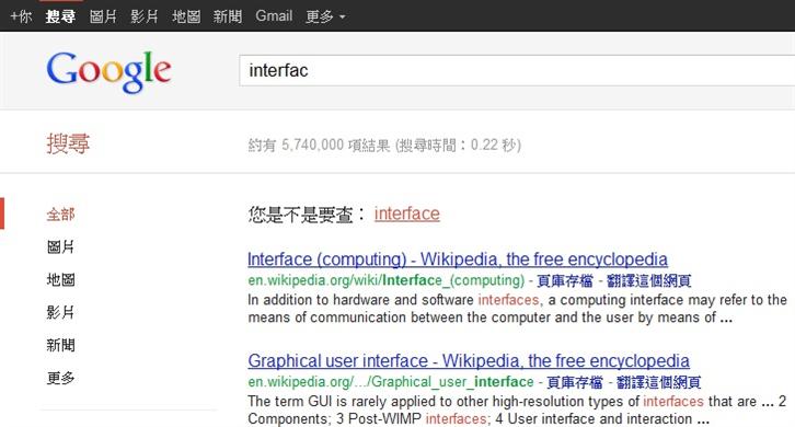
Nowadays the internet enables many different ways of interactions, from the early ‘xxx, welcome’ login message to now a mobile page-turning calendar. We’re moving towards a more humane interaction. The cold and aloof feeling you get from a machine no longer exists. The internet has come alive, it not only gives or receives, the best example is Google search engine:

▲Sometimes when you have a typo in your search, the search engine will ask you, “Are you searching for: xxx?” This extra feedback is also an interaction.

▲On the contrary, Yahoo’s search engine gives off the more ‘serious’ feeling.
If we could think from the user’s perspective and create more lively and approachable environment instead of stiff technical language or cold machine, the light-hearted and humorous approach will be appreciated by users a lot more and prompt them into staying in the website to explore more. That in itself would be considered a wonderful user experience!
Bonus example: very user-friendly manual
Are you still afraid you don’t understand the mobile phone manual? Afraid no more, this you can definitely understand! Oh, but it may be a bit waste of papers (maybe it can be replaced by other materials?) and you have to know English too.
Source References:
IxDA Taiwan:http://www.facebook.com/ixda.tw
Twitter:http://twitter.com/
Google:http://www.google.com/
Android Design:http://developer.android.com/design/style/writing.html
beanfun:http://tw.beanfun.com/
KingStone:http://www.kingstone.com.tw/
Yahoo US:http://us.search.yahoo.com/
GIZMODO:http://gizmodo.com/5840136/windows-8s-blue-screen-of-death-is-like-a-sad-girl-texting-you
————-
About Author
Gamania UI Designer Center / Hitomi Yang
Adopting a User-Center Design approach, the Center seeks to improve upon Group initiated projects to promote Gamania self-produced products and give the players the best user experience.
————–
