As the title suggests, this is an inspirational story on going from not knowing how to code, to writing a passable webpage (hehe~).
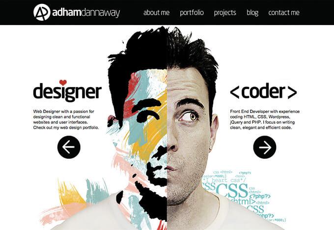
First, a self-introduction.Both my bachelor and master degree is industrial design, with an emphasis on product design during my university studies. As a graduate student, I started to focus on Universal Design, Human-Computer interface for seniors, and cognitive psychology.After graduation I became interested in non-physical design (e.g. UI, UX) so started out as a UI designer in the IT industry. Every industry has its secrets however and things aren’t always as simple as they seem (to the author, anyway). Combining design theory learned in the past with actual practice turned out to be a rocky process.
▲Image source:www.adhamdannaway.com
Webpage basics:
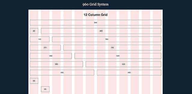
For someone who had never touched web design before, the 960 grid system meant absolutely nothing at first. The jargon on other elements were indecipherable as well. To communicate with the team, I took the time to learn from the engineers and Googled any keywords I didn’t understand. Sometimes, there was so much info it took days to figure it all out.Learning by doing really shortened the learning curve for me so I decided to share my experience with everyone.
▲Image source:http://960.gs/demo.html
Modularity and Design Guidelines:
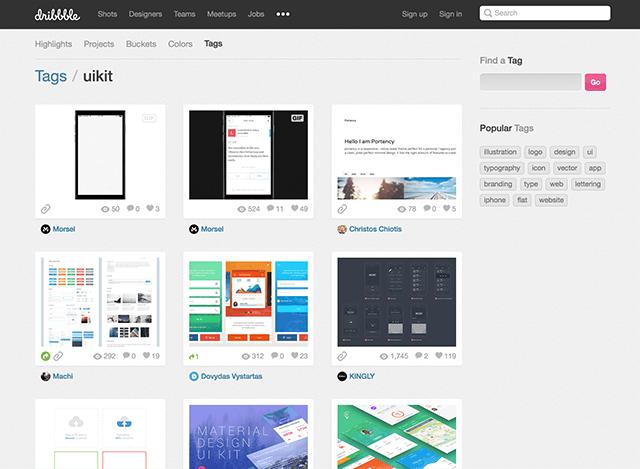
First, let’s look at the concepts of Modularity and Design Guidelines. From the perspectives of design, these two terms are usually used in “Brand Identity”. This included defining the platform’s overall color palettes, button styles, fonts and spacing. Designers can follow these guidelines to design the platform element library. The design guidelines formed by these elements then become the identity of this platform (brand). For front-end engineers, these design guidelines should be modularized because it means the CSS doesn’t have to be rewritten if an elements is repeated. For collaborative projects, it also avoids bad code that diverges from the original design. This translates into less effort and time savings during development (the designer will have to spend a lot of time on defining the design guidelines during the preliminary design phase and provide detailed documentation. In the long-term however, this is essential for creating the corporate or product brand, and for effective development).
▲Image source:UI kits(from dribbble.com/)
HTML & CSS:
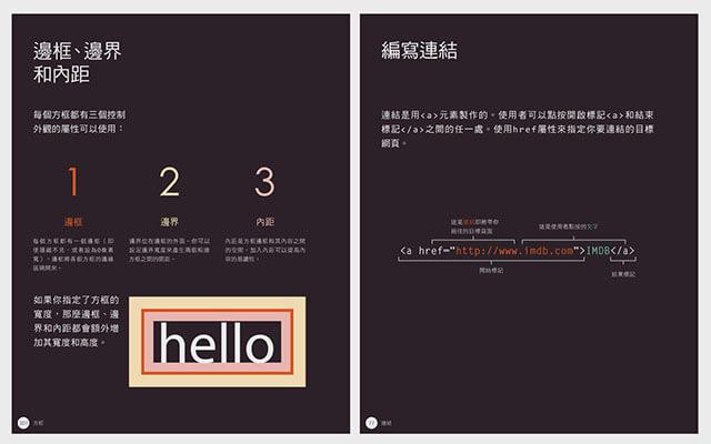
I wanted to be able to communicate with the development team so I started studying the front-end languages (HTML and CSS). Little did I know, I was digging myself into a really big hole~We all know that learning begins with preparing the teaching materials. Based on my colleagues’ suggestions, I found a translated book on the basics: HTML & CSS: Design and Build Websites. What makes this book stand out is the use of text and graphics. I highly recommend it for designers!
▲Source:『HTML and CSS: Design and Build Websites』
Good teaching materials is not enough. You need hands-on experience as well. I therefore recommend typing the code and learning the rhythm of coding while reading through this book. As for the tool to use, I suggest installing the Sublime Text editor.
This book is divided into the two parts: HTML and CSS. HTML is like the bones while CSS is the clothes you wear over the top. When we are building a website the quality of the HTML is very important. If a person’s bones are all wrong then it doesn’t matter how fine of expensive the clothes they wear are, they’ll still look crooked. I knew this quite well so I really took pains with the HTML basics (The meaning and syntax of HTML tags etc.) Some said that using Dreamweaver to generate the HTML is more intuitive and saves time (because you don’t have to write the HTML yourself). Me, I personally advise against relying on tools like this. You need to write the code yourself to really understand how HTML tags work (it also makes working with CSS easier in the future).
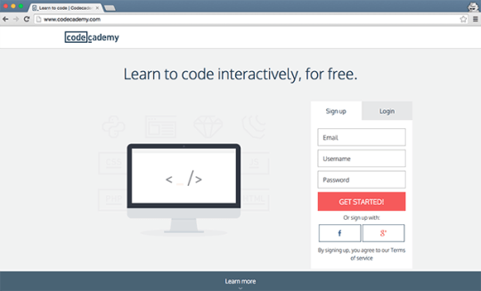
Next came mastering the CSS. After reading through the book I had some understanding of HTML and CSS concepts but not enough to really code. So I asked my colleagues for help against and they said I should register with Codecademy. This is a platform for online HTML and CSS learning courses (other programming languages are also available). The courses uses an interactive format to guide beginners through an organized learning process that reinforces understanding of concepts. When you achieve 100% progress, you are ready to take to the field (hehe~).
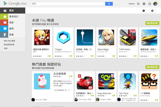
After completing the course, I decided to hone my skills while it was all fresh in my mind by finding several good websites, taking their screenshots and then trying to create identical websites using HTML and CSS. The first website I tried to copy was the Google Play website because I felt that Google’s HTML and CSS architecture/concepts were well-worth learning.
▲Image source:Google Play
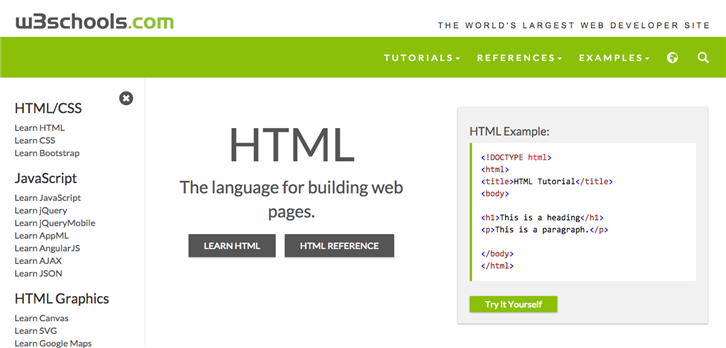
When I started practicing to slice the Google Play webpage, it immediately started exposing all the parts I wasn’t familiar with. When this happened, I read through related books to clarify the concept and also went to w3school to fill in the blanks.
▲Image source:w3school
The biggest problems with slicing that I encountered at first was the use of position and float. These two CSS properties are rather nefarious so it took trial and error. I therefore assigned myself the challenge of coding two versions of the Google Play screenshot:
All of the apps were displayed using float
All of the apps were displayed using position
This kind of practice will gradually teach you when float/position should be used and what things to watch out for when using these two CSS properties. Once you have mastered these two basic concepts, it should not be hard to build your own static websites!
In the next issue, I will cover IE Hack, CSS optimization (SASS/CSS Sprite/image compression), CSS Framework (Bootstrap) and version control (GIT).P.S. The next issue won’t be a technical essay! (The author is not a coder by trade)
Design Tongue/ Jeremy Lin
Design Tongue is a content platform focusing on topics related to user experience. These include user interface, interactive design, user experience, product design trends and service design. It aims to give more readers an understanding of what designers to and promote design thinking.
