
.jpg)
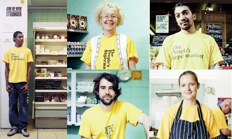
Here is a brand that stands for the everyman, generated from the notion of being “cooperative”. The chain store The People’s Supermarket (TPS) in the UK opened in 2012 with the slogan, “For the people, by the people”. Their aim is to provide the local community with good quality food that comes from local producers sold “back” at a fair price to local residents. Sticking to the principle of “For the people, by the people”, TPS also allows the entire staff to participate in the management of the supermarket as a collective community. Members that contribute 4 hours of their time every month working in the store will receive a 20% discount off of their in-store shopping.
Simple and Approachable Features
TPS has successfully created a supermarket literally belonging to “the people” and has gained recognition through simple euro slot shopping bags and their distinctive, clean-cut yellow label with black captions. The euro slot design is by all means nothing new. It is produced easily with a europunch and integrated with the common paper bag found in any supermarket. The simplicity of their brand image reflects again the notion of being available “anywhere for anyone”. In market-oriented fields, a recognizable corporate identification system (CIS) is crucial in order to sustain competitive status. The bright yellow design with a simple euro slot appeals to the common ground people, and resonates the “cooperation” valued by TPS. TPS has further launched “The People’s Toast”, “The People’s Kitchen” and “The People’s Wine” etc, all with their signature euro slot label, so that consumers are able to associate the products with the TPS distributive channel.


The Supermarket’s Color; The People’s Color
TPS chosen yellow as their color of association on the grounds of stating that there are no race, gender or age indicators in their target consumers; it is truly “belonging to the people”. Upon wearing the TPS yellow T-shirt, they are “for the people, by the people”, in a very tangible fashion.
References:
http: //www. guardian. co. uk
http: //www. mydesy. com ;
http: //www. channel4. com ;
http: //www. inspirationspam. com