When was the last time you came across an online ad? Yesterday? Last week? Last month? Or maybe never?
It is an proved fact that consumers are even less convinced by the advertisements they see. According to the following research: Only 14% view commercials as trustworthy, yet 78% take in a friend’s or any online reviewer’s opinion as a reliable source. Consumers are now smart enough to look past the fancy packaging of a product, hence the birth of “embedded marketing” and other promoting strategies as such. On the web, a new form of media is also sprouting for similar reasons. In order to present the ads as “natural”, advertisements are merged with the site itself to create “Native Ads”.
What’s so special about native ads?
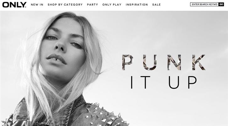
In conventional web ads, they are displayed in banners above or on the left or right of the screen. Consumers can easily recognize these messages as external information irrelevant to the site’s interface itself and can filter them out as additional. Native ads, however, present these advertisements in the most natural way and feed you promotional information with a hidden agenda. The consumer then latently accepts the info without skepticism.
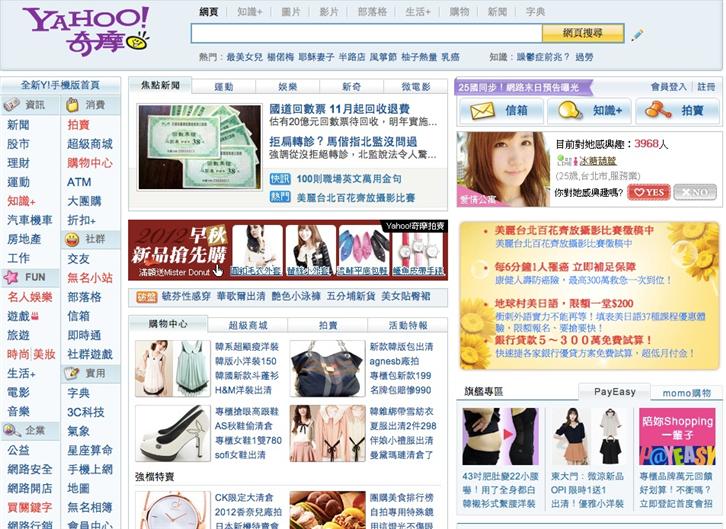
▲You don’t need me to point out where the ads are!
Only The Liberation
This European clothing line from Denmark targets young woman within the age of 15-25 and embody the spirit of an “Only Because We Can” attitude. To promote their 2012 summer collection, Only hosted an online event called “The Liberation”, describing 3 young women and their lives in a small town: it is an interactive short film about how they are free in their spirit and decide their own course of life accordingly.
It is not a new idea for the fashion industry to promote products through film, yet The Liberation is unique due to the following 3 perspectives:
1. Visual Integration:
Combining the user experience with consumer experience, as to tone down the message of “standing-out” and looking “exceptional”. The message is conveyed as subtly as possible.
2. Consumer Choice:
Instead of trying to desperately grasp attention, the advertisement is an optional choice that consumers can chose to look into, or ignore.
3. A Profound Message:
By celebrating individuality and originality, consumers can related to the message that is given beyond the act of just buying a product.
Let’s take a look on how they do it:
During the short clip, you may click on either girl and “interact” with her; the products modeled by these characters are then shown to the readers, who, if intrigued, may further click on either clothing to view its product details. The plot development also needs to be determined by you, for example: Start the car to escape a scene, or zip up the protagonist’s denim jeans. The Liberation collaborated with various media platforms, too, such as: Facebook, Twitter, or the Pinterest, as to gain more public exposure. Afterwards, the site will display all your “decisions” made for the characters, along with the products that might potentially interest you.
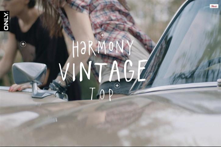
▲All characters that appear in the clip are interactive.
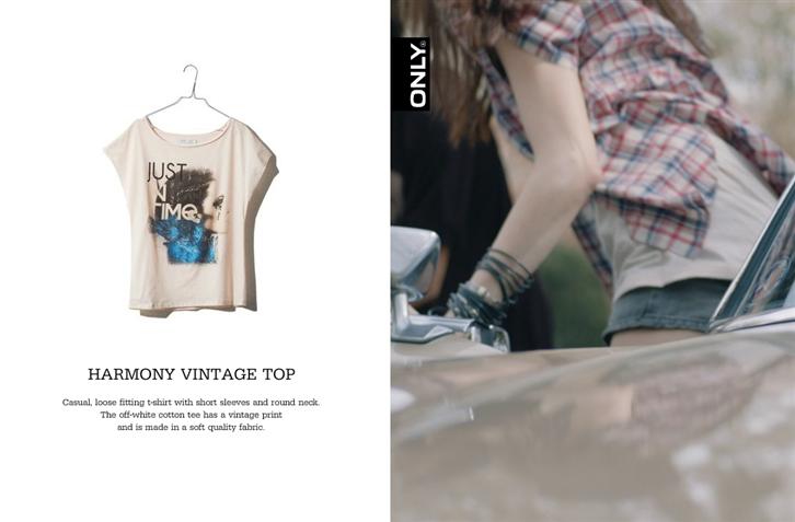
▲You may directly purchase the actor’s clothings if you wish.
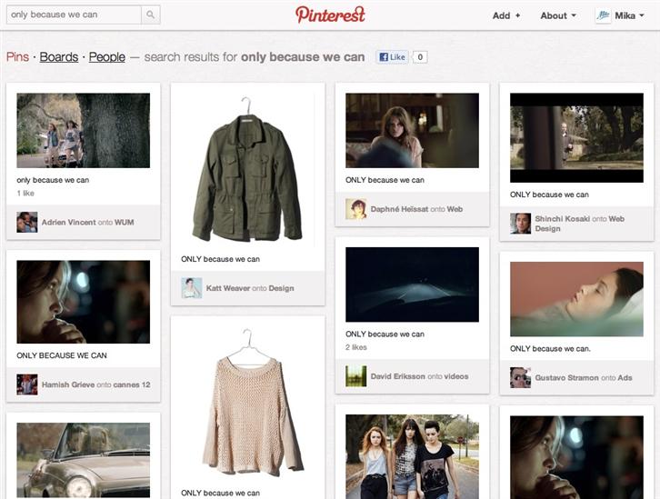
▲On Pinterest: Search keywords “Only Because We Can” to see others’ opinions.
The Liberation is still essentially a catalogue, one merely with a better package and interactive design. Yet, it allows its readers to look past the obvious and experience something more than just sheer advertisement. The choice up for the consumers to decide. Those that want to know more can click to enter. Those that wish to share it with a friend can do so. Those that just wish to enjoy the film are allowed to. It is all about the needs of the consumer.
As we welcoming the coming of the digital space era, it is important to know what the consumer is looking for in an ad. It is the key to true marketing.
