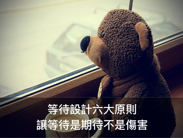
“Waiting” is a process. It is something unavoidable in daily life.
We wait to ultimately reach the thing or the person we desire. We usually have a positive mental image of what awaits us in the end. However, the process of waiting creates anxiety, impatience, and even desperation and anger. Therefore, a key experience design detail for a waiting process is to guide the user towards positive emotions.
In “The Design of Everyday Things”, Donald A. Norman proposed six principles of design, which I have listed below and applied to using the example of waiting in line:
Principle No.1: Provide a good “mental model”
The details of a mental model will be spared here as the topic was already discussed in the article “Honey, I Simplified the Product!”. A mental model is an important basis of understanding how lives function. In the process of waiting, “uncertainty” is a major source of strong negative emotions. When a problem arises, what people need is confidence. They need to know what is going on, and that the relevant representatives have at least acknowledged and are dealing with the issue. The uncertainty can be minimized as much as possible with guarantee and attention.
Thus, to create a good mental model with correct feedback can help people understand the current condition and status and relieve their worries.
This reminds me of the day I was going to Mainland China for work. It was the first time I have ever used an airline’s self check-in service. I got the ticket but I needed to check in my luggage. I glanced at the long queue in front of me at the check-in counter, in which everyone was waiting with their luggage. I was not sure if I should also wait in line and had a bunch of questions in mind: Have they all checked in already? Should I get in line behind them? What are they queuing up for? Am I in the wrong queue? Who should I ask? And so, I just got in line behind the long queue. After 15 minutes in the line, a ground crew staff member came up to me and asked if I had already checked in. If so, then I only need to get into the shorter line. Then it only took another 5 minutes to complete my check-in.
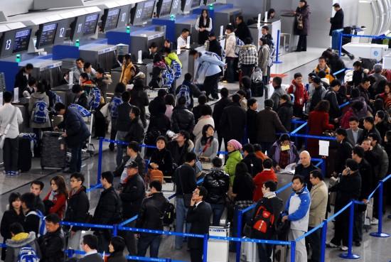
▲ Travelers who are unfamiliar with the airport which lacks clear signs tend to queue up in the wrong line
Principle No. 2: Make the wait seem reasonable
When people have no choice but to endure the wait, they should be told the reason, and they should know that the wait is unavoidable. If they are not told the reason, the people will make their own assumptions, which usually leads to worries and anxiety. This is why timely feedback and explanations are very important. When people have a good understanding of the ongoing back-stage action, they will be inclined to think that the wait is necessary and appropriate.
The most direct example of this principle would probably be the setup of the Din Tai Fung restaurants. While many chefs are folding the 18-fold dough for the xiao long bao (steamed pork dumplings) behind the transparent kitchen window, the number calling wait area next to the window has an electronic number display to indicate the table is ready for a certain number. The friendly employees will even offer the menu to allow waiting customers to pre-order the food. These methods help the waiting customers understand that the food is quickly being made, and predict the time left until their table is ready. They can spend some time on the menu while they wait, which reduces the uneasiness and distracts from the tedious wait.
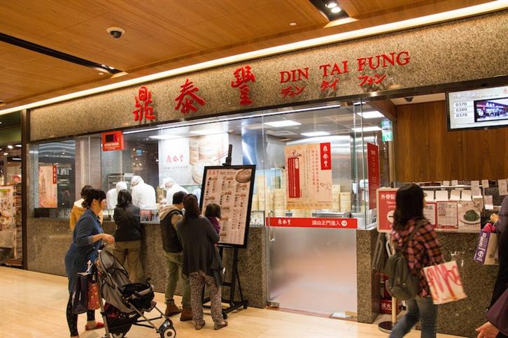
▲ The transparent kitchen window at Din Tai Fung improves the customers’ confidence in the food and eliminates the worries of the people who are waiting
Principle No. 3: Meet or exceed expectations
When our actual waiting time exceeds expectation, and we blow a fuse because the hope of the anticipated benefits have fallen through. Many places will try to suggest a waiting time (even if this information was not offered, people will still ask how long it would take), and we recommend to give a time that exceeds the actual estimation (within reason of course). This will pleasantly surprise the customers who feel that they have waited less than expected.
Moreover, allowing the waiting customers to engage in a meaningful task helps transform the wait into a positive experience. Speaking of which, we must mention Hai Di Lao Hot Pot. Customers waiting for a table receive free services such as shoe shining and manicures, while they can occupy themselves with snacks and games. With bonuses like these, some might even think there’s not enough time for waiting.
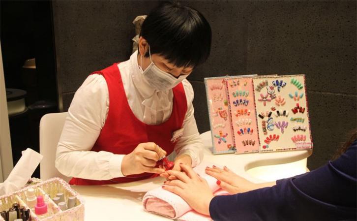
▲ “Hai Di Lao Hot Pot” offers free shoe shining, manicures, snacks and games for waiting customers
Principle No. 4: Keep them busy
“Being so busy you forgot the time” can also be used on the design for a waiting process. Even though the actual wait time can be precisely measured, our perception of time is determined by psychological factors. Our sense of time is largely affected by our mental activity. Therefore, we can be distracted if the queue looks shorter, or is full of interesting things, or if we have to fill out necessary documents.
For example, many theme parks design a winding queue to make the line look shorter, or have a small transition room for a pre-experience. I still remember when I was in line for the Wizarding World of Harry Potter at Universal Studios, I couldn’t figure out how long the winding queue was exactly. From what I saw, it seemed pretty short, and there were many speaking virtual characters projected along the queue and realistic decorations that attracted my attention. Before I realized it, it was my turn.
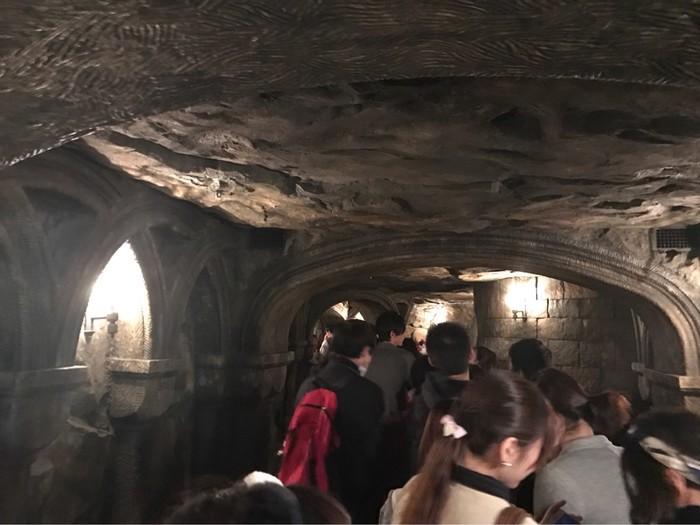
▲ Theme parks often set up interesting things to distract the people in-line
Principle No. 5: Fairness
Have you ever hesitated about which line is faster at the check-out counters before you take one, only to find that your queue is always slower than others and get frustrated about your decision? Psychology proves that we will always feel like we are in the slowest line no matter which line we are in. If our line moves faster, it’s easily neglected, but our minds focus on the speed of other queues, which results in the feeling of unfairness waiting in line.
Therefore it is a better design to only setup one queue while the first one in-line gets to wait on several clerks. This is more efficient and reduces the negative feeling of unfairness. For instance, when people are lining up in a single queue at customs or check-in at the airport, there are several issues:
1. How do you know which staff member is the least busy?
2. The customer has to wait for a clear signal, walk to a staff member to put down the items, and start the transaction. => Less efficient
Thus a staff member can be assigned to manage the queue and instruct the customers to approach the vacant counters.
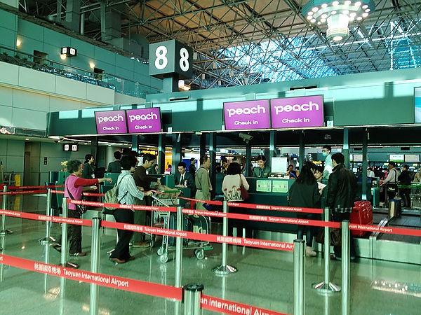
▲ One queue with many counters
Principle No. 6: Positive beginnings and endings
Finally, we arrive at the last design principle!! “A good start is half way to success.” That saying is only half correct. According to psychological research, the perceived order in human memory goes: the ending => the beginning => the process (the long wait…), so
Always remember to end well!
Always remember to end well!
Always remember to end well!
This will make the whole process more positive, because memory weighs more than reality. The memory of an event is the active reconstruction of the overall experience, and undergoes many potential distortion. The latter part of the experience is much more important than the early or middle parts. If the ending part of the queuing experience in reinforced, then the satisfaction is effectively improved. That is the reason why the restaurant offers us dessert after a long wait to show their appreciation, or the theme park offers souvenirs for us to take home. It’s the reason we will feel happy and completely forget the unhappy process of waiting in-line.
This concludes my summary of the 6 design principles for a waiting process, which focuses on designing the experience. If this article receives more than 600 claps, I’ll find some other time to write down and share the design principles for the human-machine interface in a waiting process. Thanks for reading! : )
About the author:
Livia Yang
Adventurer, UX Designer, PM . “Stay Hungry, Stay Foolish”
Photographer : https://www.instagram.com/liviayang123/
Contact info: liviayang.ms@gmail.com
From “6 Secrets to Designing a More Pleasant Waiting Experience” by Livia Yang. Reprinted with permission by the author.
