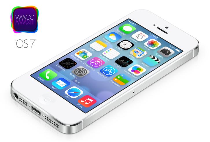
Apple’s new iOS 7 was introduced during the 2013 WWDC and immediately became the talk of the day. The use of “Skeuomorphism” in its UI design is replaced with the minimalist “Flat Design”: It is said to be the biggest change in iOS history since the invention of the first iPhone.
Of course, there has been much debate on whether this change pleased its fans or not. Some stated that the new interface showed that Apple was capable of coming out of its own shell. Others say that it was losing its brand image in favor of a more “cutesy” style. Regardless of the reviews, it is the action of change itself that caught the smartphone world’s attention. So what triggered Apple to make such a big move? Let’s find out.
Why Flat Design?
Conventional iPhone interfaces tend to simulate real objects, for example, notepads, boards, shelves and wooden frames. The person behind this was Johnathan Ive, Senior Vice President of Design at Apple Inc. Ive grew up in the age of modernism and was always fond of abstract and geometric designs. Together with Steve Jobs, they paved the way for most of the dominant Apple products with a series of functionally clean, aesthetically pleasing products.
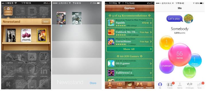
Smartphone was not really a “thing” when Apple launched its first iPhone, therefore in terms of style, it deliberately kept the more realistic images as to remind users what kind of product they replace. But now, the times have changed, and mobile devices have already proven themselves to be essential to modern life. Apple no longer needs such images as a reference to “life as we know it”, therefore, ideas for a new design have long been under discussion.
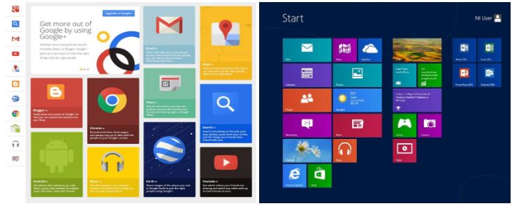
On the other hand, Google, Facebook and Pinterest also served as (unintentional) promoters of Flat Design. Apple, with the world’s most well-known brand image, no doubt hopes to associate themselves to these social mediums that, like themselves, represent the New Digital Era. The point of Flat Design to be simplistic, simplicity isn’t simple. Ive said it better than anyone: “Design is not an appearance game we’re playing”.
What’s New in iOS 7?
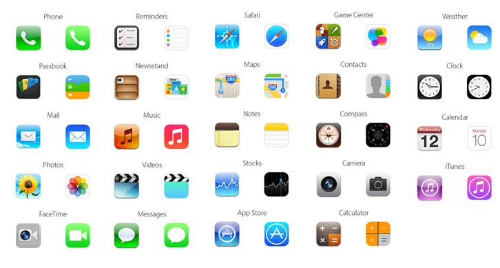
Another major change in iOS 7 is its use of vibrant colors, adding weather effects, and special fonts such as Helvetica Ultra Light to compliment HD Retina Display. The desktop background is also interactive and gains a sense of depth and perspective. This new camera interface allows swiping between four different modes (video, photo, square photo, and panoramic photo) and offers live photo filter previewing.
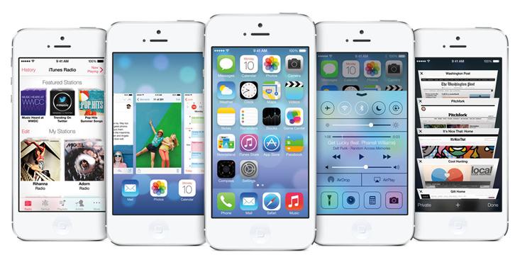
Other new iOS 7 features such as the Control Center, Multitasking, iTunes Radio, Photos and AirDrop… You might find some of them very similar to Android, but for Apple fans, these are completely new experiences. Take a look at the following video to find out more about iOS 7:
However, some of the iOS 7 users stated their disappointment in the lack of significant improvement in its core functions. Some even expressed a willingness to take on Android for a change, just for the time being, feeling that Android is “easier to get used to and much more practical” in terms of everyday use. Nevertheless, I am curious in what new changes will also take place in App Stores and how iOS 7 will affect the overall market of Apps. We can come back to iOS 7 later this year when it is available. Fingers crossed!
Oh, last but not least, one critic summed up what many might be thinking on noticing the similarities between iOS 7 and Android, which happens to also be Steve Jobs, favorite Picasso quote: “Good artists copy; great artists steal.” So, what do you think ?
Source:
http://goo.gl/TSccUj
http://goo.gl/QfwCSd
http://goo.gl/A5fOQR
http://goo.gl/TdQnlI
http://goo.gl/n1bojp
http://goo.gl/s8w9Jc
———————————————————————————————-
About the author
Gamania User-Experience Center / Michelle Lin By methods of UCD (User-Centered Design), this model aims to execute or modify all corporative projects as to improve and promote Gamania in-house user-oriented products.
———————————————————————————————-
