.jpg)
In this era of internet age, information inundates the virtual world. Whenever you need to find any information, the first place to be is the internet. There are so many competitors on the web, when a user is not satisfied with your service, please believe that his/her patience won’t last over a minute.
With that said, how do we provide an intuitive and thoughtful way of search method for users? This is an important issue to address.
Especially when a website provides a service of massive information, they would need a thoughtful information architect who understands users’ behaviors in searching and puts that thought into website planning.
Users’ Behavioral Model of Information Searching
Do you know what kind of method your users use to search information?
Usually they regular routine would include skimming & scanning , searching keywords, searching within links, or ask other people for answers. What about their searching behavioral model?
Well, if you observe them closely, it’s not hard to find out that their behaviors consist of three key actions: view, query and request. Sounds a bit abstract? Let’s take a look at this example:
Step 1 A-Kai wanted to purchase the website ‘books’ to purchase Dante’s Inferno, so he typed in keyword, ‘Inferno’ in the searching engine
Step 2 He scanned through each item and clicking further into the book result from the book recommendation list. However, he still didn’t find his object.
Step 3 Therefore, he re-entered the keyword, this time, “Dante’s Inferno”
Step 4 He found what he wanted to buy but realized that the books were all sold out. He sent an email to customer service to request for it.
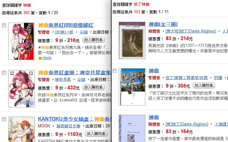
Users search information through these three methods, and these methods morphed into diverse and complex behavior models. Based on this capricious information search model, Dr. Marcia Bates concluded and developed a model theory—Berry-picking model.
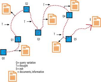
The above illustration indicates that when users search information, they need to first have a ‘query’(Q), then through their ‘thoughts’ (T), they would discover their anticipated content (documents, information), then they would carry on with the next search. Bates found out that document placements are like strawberries in the garden, they will be allotted at the appropriate places that users recognize. And users persistently switch between searching and viewing until they are satisfied with the information and leave (Exit).
Understand Users’ Information Needs and Search Behavior
Now you understand users’ search model, now you could dig deeper to understand what kind of information demands the users make and how to do it.
Through these studies, you may have enough theoretical ground to construct a most user-sensitive information structure and enhance the usability of the website.
How could we achieve that? Here we recommend two most commonly used methods: search analysis and scenario query.
Search analysis means to acquire search query information from the website and analyze the content of users’ search and their behaviors.
Scenario query means to have face to face contact with the users and conduct queries and observe user’ actual behaviors.
Organize Information on Your Website
After you understand your users’ behavioral model regarding information searching, perhaps you already have some thoughts about revising the next version. Through tactics such as studying users and interviews, you may have enough information to optimize your website: such as modifying user interface, adjusting visual presentation, or program re-writing etc. How should we construct the key information structure?
Basically it can be categorized into 4 systems:
Organization System
In terms of the organization of information that users search, it can be divided into ‘accurate’ and ‘vague’ systems.
Accurate system includes alphabets, timeline, and geographic location. These are the information that users already know, so it is suitable for searching in known information item.
Vague system includes themes, tasks, audiences, comparisons and mix & match. These are suitable for viewing and association related interactions because users are not sure about what they are looking for.
In defining how a user view the website, it has to do with the organization structure he/she chooses.
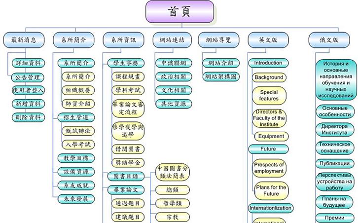
Database structure, bottom to top approach, organizing information into groups for easy search and information extract.
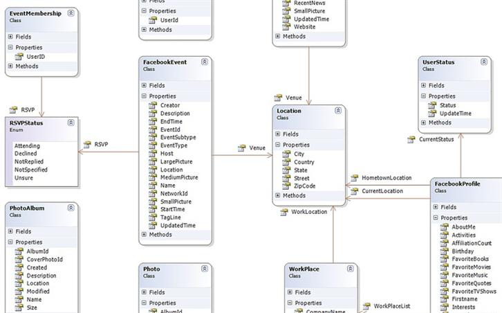
Hyperlinks: connecting information items and groupings in a non-linear way, to complement the insufficient parts of the above-mentioned.
Label System
Label system means how to convey information. There are two common formats: word and graph types.
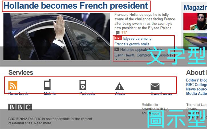
Label system means how to convey information. There are two common formats: word and graph types.
Graph type means to visualize texts into icon links
Guiding System
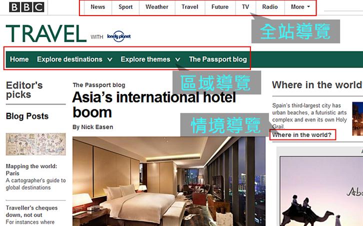
The purpose of guiding system is to help users understand where he is at right now and where he can go.
Whole website guide: all the pages on the website are presented as guiding system
Partial guide: assisting whole website guide
Scenario guide: not suitable for placing in whole website or partial guide, normally place within articles
Sitemap: a system installed for website with certain content, similar to the table of content in the book
Index: arranged alphabetically or according to keywords, a non-stratum search system
Search System
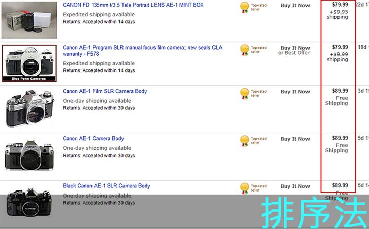
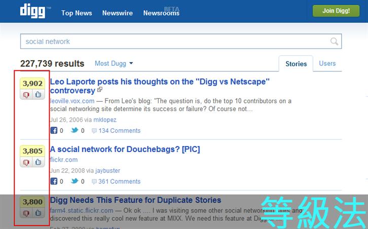
Search system search information based on the texts defined by the users and the result will be congregated and presented. The result is often presented in two ways: through orders or grades
Order sequence becomes most relevant when a user needs to make a decision. For example, when comparing prices in the shop, the price order may help the user to make a decision.
Grading sequence is used when the information needs to be comprehended or learned. For example, in the Q&A website where answers are graded or based on the amount of recommendations to help users swiftly skim and scan the information.
Summary
The internet nowadays is very much content oriented, in the overwhelming flood of service providers online, how do you make yourself stand out among a sea of competitors? In addition to providing unique services, the usability and optimization of the website have gradually become an important issue that everyone needs to take heed of.
Among which, information structure is an important indication of evaluating usability. In addition to optimizing the website, you need to enable your users to find the right page swiftly. If you don’t, then the users may decide to leave the website disappointedly and the existence of the website, wasted, This is the crucial reason why constructing information the right way is important.
Through observing your users, and understanding their search model, you can fix problems once and for all, construct a pathway of information searching that suits your users the best. Help your users pick the sweetest strawberries, because that is your responsibility as a website architect!
Reference
Berry-picking Model by Marcia J. Bates
http://pages.gseis.ucla.edu/faculty/bates/berrypicking.html
Information Architecture for the World Wide Web
http://shop.oreilly.com/product/9780596000356.do
Ambient Findability
http://semanticstudios.com/publications/semantics/000008.php
————————————————–
About Author
Gamania UI Designer Center/ Kai Hsu
Adopting a User-Center Design approach, the Center seeks to improve upon Group initiated projects to promote Gamania self-produced products and give the players the best user experience.
————————————————–
