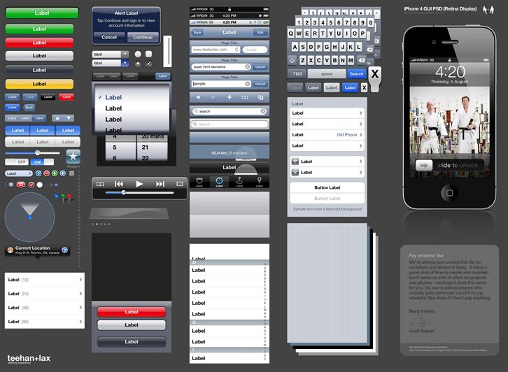
Mobile phone makers are increasingly focusing on hardware upgrades rather than functionality. In the rush to introduce faster processors and add more Flash memory, they forget that it’s the user experience that decides how practical the new hardware is.
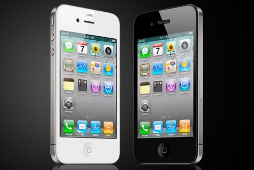
Though the iPhone dominates the smart phone market, once you remove the IOS system the actual hardware is something that any other smart phone maker can put together. What they can’t imitate is how user-friendly and intuitive the design of the operating system is.
The UI has always been the most easily overlooked part of software design. Smart phones are now popping up like mushrooms after the rain but poorly designed UI can lead to user inconvenient and backlash. The small screen only exacerbates any problems.
Application developers know that most users are now used to the gestures and elements provided by iPhone so their apps must satisfy the convention as well. If an app doesn’t support swipe scrolling or two-finger zooming, it will have less chance of being a success. Developers must therefore put themselves in the user’s shoes, understand the user’s requirements then integrate it with usability features in order to deliver a great user experience. So what defines a suitable UI? Usability and interactivity are now crucial to a smart phone’s success in the market. Though difficult to implement, these design details are essential. Products developed by the industry and tested by expert users may have hidden usability problems for potential users. Actual interactive behavior and usability design have are therefore something developers must now master.
Features of a Good UI:
1. Give user incentive to use the UI
A good UI provides the user with appropriate feedback and gives them an incentive to experiment. As no training is provided, most users tend have a certain way of using their smart phones already. If the software does not behave as the user expects and fails to give proper feedback then the user will become discouraged and start looking for a replacement.
The vibrating icon gives the user an incentive to continue.
2. Ease of use
An uncluttered interface is easier to use because it is more intuitive and also reduces the chance of user error.
3. Unified interface design
A well-designed user interface should be uniform and consistent. The framework of the interface should be obvious and unified as well. The styling should be consistent with the software.
4. Provide visual cues
Some developers craft very fancy user interfaces but forget to put themselves in the user’s shoes. An interface that is easy to understand and use is the most important fundamental part of UI design.
5. Organized interface layout
The interface should be laid out in a logical manner to make it easier to use.

An organized layout is easier to use.
6. Safety
Users should be given the freedom of choice. All decisions should be reversible. A warning prompt may also be provided when the user makes a dangerous decision.
7. User-friendly customization
The option should be offered for customizing the interface to the user’s personal preferences including an expert mode or beginner mode. The user-friendliness of a system ultimately depends on its efficiency and user satisfaction.
Based on the above, it can be seen that a well-designed UI not only encourages intuitive and accurate understanding in the user but can also show the user how to overcome the hardware constraints so the user only experiences the positives and does not notice the minor negatives.
Reference:
http://www.ithome.com.tw/itadm/article.php?c=60702&s=4
http://www.digitimes.com.tw/tw/dt/n/shwnws.asp?cnlid=13&packageid=3734&id=0000192969_KXPLRPV550JZ46LUSVZN1&cat=6
————-
About the Author
Gamania UI Design Center / Liweii Chen
The UI Design Center applies a User-Centered Design (UCD) approach during development or improvement to promote and deliver the best user experience for Gamania’s self-developed products.
————–
