
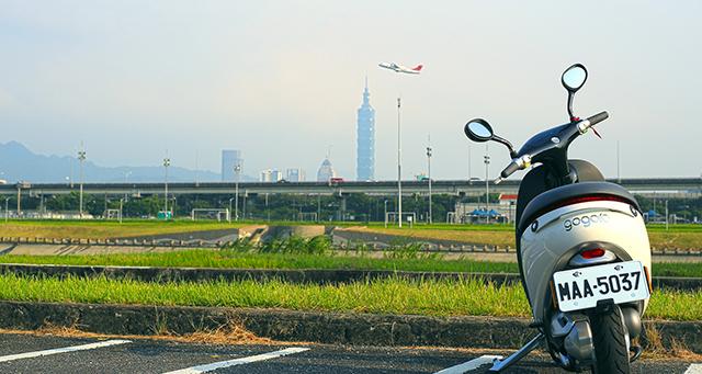
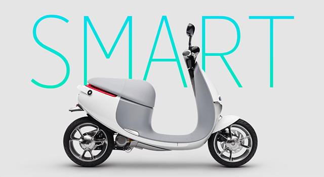
After the Gogoro City Exploration Beta Program event, other than the talks and excitement, what else was the most memorable? That’s right, the unique experience! Do you have some preliminary understanding of Gogoro after the last article on cycling experience (Gogoro X Design Tongue: When future scooters enter life experiences). This time, we’ll be doing a basic introduction on the Gogoro app experience and its extended application, allowing you to learn more about the interactive UI and possible future developments of Gogoro app.
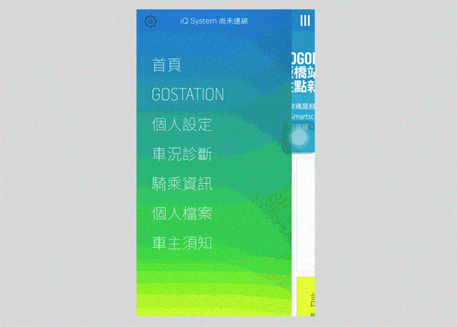
App UI and Interoperability
Able to connect with the scooter, and conduct customizations and inspections; they are Gogoro app’s primary functions. Out of which, the customization offers a multitude of options, so the UI must be able to simply all the complicated procedures, as well as providing good interoperability, feedback, and timeliness (the corresponding interaction between the app and scooter customization). So how does Gogoro achieve this? Just read on! We’ll be sharing some of how the UI operates and transition effects (animations).
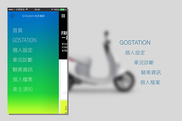
▲app functions preview
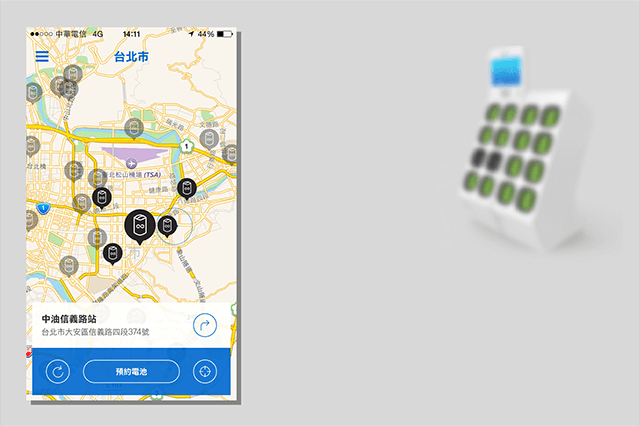
GOSTATION
GOSTATION can allow motorcyclists be aware of nearby charging stations, as well as reserve batteries to prevent being in a situation without batteries. When a user enters GOSTATION’s page, GPS will be enabled immediately, as well as scanning for charging stations near your position. During the process, a dynamic effect resembling a radar will appear to increase the patience level of the user as well as the sense of high-tech of the app. After the search, surrounding charging station info will be shown centered around the position set. If the user is unfamiliar with nearby traffic, navigation features could also be enabled to assisting in reaching the charging station. In general, all situations the users might encounter have already been considered by the designers. However, there are still special scenarios that might occur, such as:
Unavailable business hours and status of the charging station (some stations operate 24/7, while some are closed and unusable), that may cause the unavailability of a battery when the rider arrives.
Additionally, it be preferable if the number of fully-charged batteries are shown to prevent situations where only a half-charged battery have to be used when arrived on-site, and have to reach the next station for a full battery. Of course, this may not be a likely scenario for a single rider, but may have the risk of occurring if a group of riders are traveling together! If this information is available, the group could then divide up and charge at different charge stations.
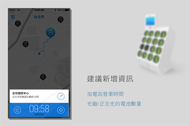
Next, would be that the users are not able to check GOSTATIONS beyond the radius of 10km, and the system would notify that the range is beyond the default settings (maybe the simulated scenario was that: since the battery is running out, displaying the nearest charging stations would be a priority, and did not expect the users may wish for this information to plan out the routes). This issue has now been addressed. After the update, the UI uses icon transparency as the indication for distances; opaque means the charging station is within 10km, semitransparent means it’s beyond 10km. The freedom of operation is improved, as well as being more easy to use.
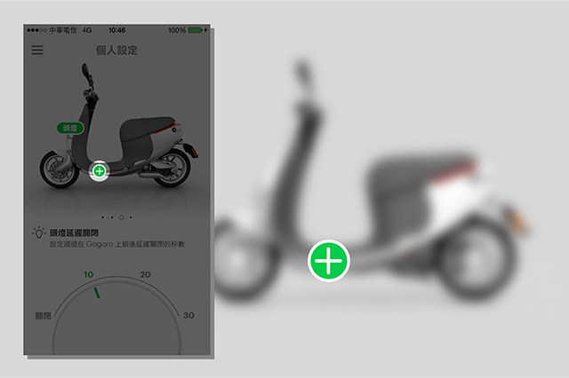
Personal Settings
Personal Settings is one of the most eye-catching functions of this app, which enables the user to customize the style and riding habits of the scooter. The user is required to setup the scooter via the app, therefore mapping up needs to be, as well as feel, intuitive. E.g. the app is able to setup “cornering lights”, which most users probably aren’t aware of its functions. Or, where exactly are the cornering lights on the scooter? Therefore, Gogoro divided the UI into two regions. The above is the schematic view of the scooter displayed primarily in 3D, assisted by text. Below is the adjustment and control area. This design allowed the users to intuitively relate functions to scooter modules, easing the learning curve.
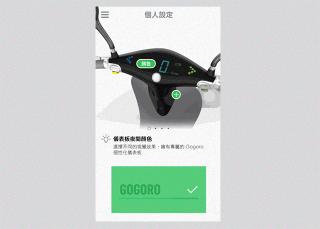
Additionally, there are options that can be configured which also utilize video preview and audios to assist the users in seeing the effects and status after being configured.
The setup process is as simply as: select -> preview -> confirm. Examples below:
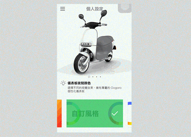
The only thing that is confusing personally, is the ㊉ icon displayed in the hardware visualization area. I thought ㊉ is used to add additional rules to Gogoro, but in practice, it is “switching” to another module. Though there are no such confusions found among the users yet on the net (maybe it is I who think too much), but I thought I’ll just throw out a topic of icons and their symbolic meanings for everyone to think about.
Vehicle Status
Different from traditional scooters, Gogogro houses 30 set of sensors with 25 of them in the battery, which can be scanned via the app with one click, enabling the users to always be aware of the status of the scooter, and learn about the exact position where malfunctions occur. Relatively, providing information to users in an objective fashion allowed everything to be more transparent, and reduced the situations of information asymmetry. Of course, to maintenance personnel, they are also able to perform maintenance on malfunctioning parts more easily and precisely, greatly improving efficiency!
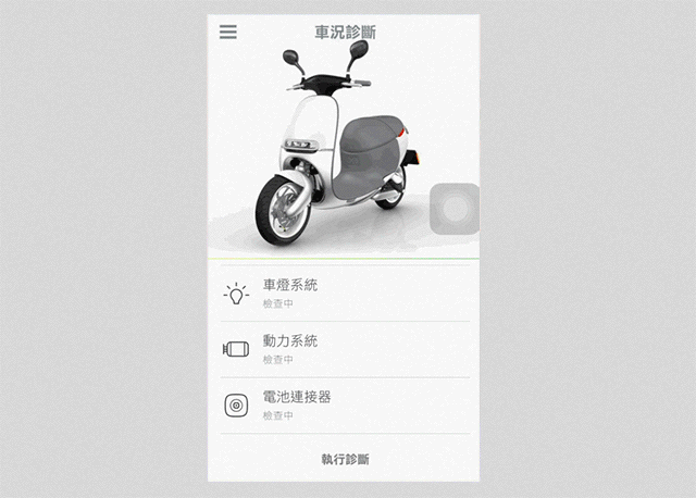
The sensors would also monitor the status of the scooter, so whenever issues occur, the app would warn the rider in cases of improper handling, toppled scooter, and so on.
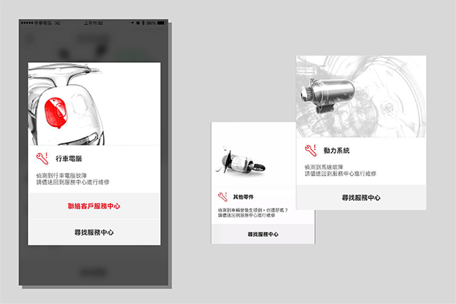
I especially enjoy the animation of checking the vehicle: After the Diagnose button is clicked, the scooter would start to rotate, and be scanned from bottom up. Scanned regions would be presented in semitransparent wireframe. Then, after one rotation, the scan would be complete. Why do I enjoy it?
Adding animations to the scanning process is eye-catching, and reduces impatience in waiting (though it doesn’t take long). A complete rotation of the scooter, as well as being scanned from bottom up, make the user feel the scooter as been “thoroughly” inspected, and is more at ease and trusting psychologically. The bottom area is the inspection zone represented in lists, somewhat like a checklist, and feels very professional (SOP is important)! The only illogical thing is:
Even when the phone is not connected with the scooter, the app can still run the scan functions. This seems very illogical, even doubtful of: I am not even connected, but I am able to inspect the scooter; could it be I’m only seeing fixed scanning animations when I am connected with the scooter? Therefore, I recommend keeping the current status when entering the page. When the users want to make a full system scan of the scooter, then notify the user that the scooter is not connected, while guiding the user through the mapping process. This would gain more confidence from the user, as well as showing care.
Riding Information
Riding Information page provides the users with past 12 riding histories, including the average speed, maximum speed, energy efficiency, and the amount of carbon saved. On top of that, also the date for the next maintenance and parking location.
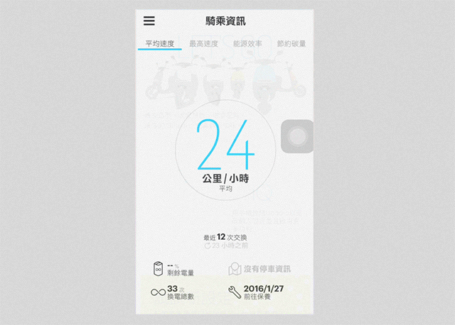
However, why only 12 histories? In term of speeds, the average of 12 histories doesn’t seem important, while also prone to the influence of extreme values. Also, for a person who loves speeding as me, I find the average speed way too low. It is probably because of the red lights and varied speed limits in the city. Therefore, this data is insignificant to the users.
On the other hand, the maximum speed would be something to check out. While riding the scooter in high-speed, the rider could not check the riding speed, but it could be checked via the app when stopping to see if the records are broken again (well, you should abide by traffic regulations). But the value represents the data recorded during the last 12 battery exchanges, not the highest speed recorded while riding. Other than that, maintenance date and parking location are practical functions, assisting the system in recording relevant information.
Personal Files
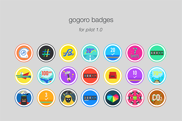
The most interesting part in this is collecting medals! Gogoro designed an achievement system, and when some riders complete a certain task or objective, a special medal would be awarded, and an achievement unlocked! These medals would also be added according to certain holiday seasons, granting surprise and expectations from the users. For example, during the Typhoon Soudelor, going out to charge and earning a “better go home” medal unexpectedly, fully presented Gogoro’s humor, as well as its care.
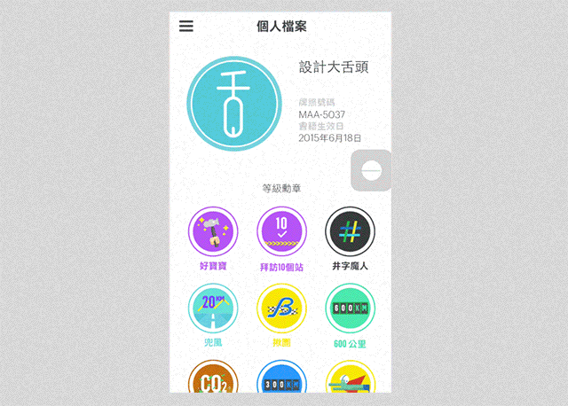
During the Gogoro City Exploration Beta Program, some pilots collected all 21 medals. If you wish to learn what each medal means, please refer to: Gogoro Medals/Medal collection information–Pilot Version (21 medals). It’s so interesting!
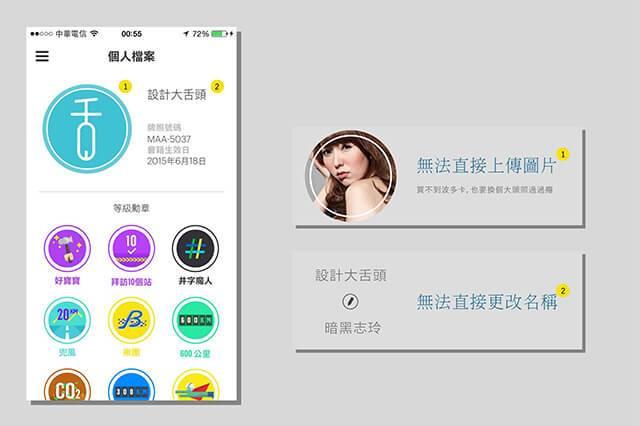
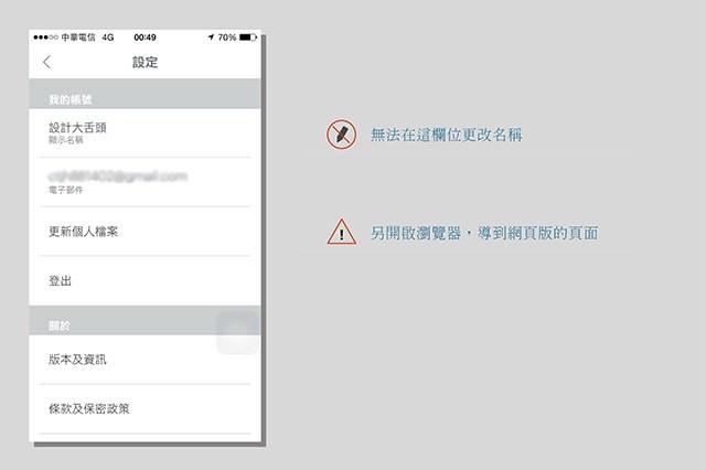
The structure of this part of the page is simple, so there’s no big issues while operating. The only lacking thing would be you cannot modify your name and portrait directly in the app. In the previous version of the app, changing your name must be done through the website. The app does not support this function. After receiving customer feedback, a link to the website is added to the settings page in the app, allowing the user to connect to the website to change their names. But it is still a drag for not able to change directly in the app itself.
Maybe due to development time constraints, there are priorities in developing functions and amending issues! I believe this small issue would be resolved in the future.
Possibilities in app expansions
The greatest strength in software is the cost of updating is much lower than hardware. Through software developments and updates, Gogoro is able to strengthen and integrate it with the hardware, getting closer to the true title of a “smart scooter”. In terms of interactions with the smart scooters, the app will play the role of expansion and simplifying operations. Software applications simplified the appearance on the hardware (such as removing actual buttons). Interoperability would also not be sacrificed due to the limitations of the size and shape of the hardware.
Taking household phones for example, due to the limitations in actual buttons, the functions maybe: hold A for 3 seconds to modify time, and then select hours and minutes for adjustments, or, hold A+B for 3 seconds to enable certain functions. As you can see, operating via actual buttons in the past is just not very user-friendly! Using the app interface, all functions could be laid out by category and hierarchy, further optimizing convenience in usage, as well as multi-functionality.
▲Multi-tasking, multi-hierarchy UI concept diagram / IMG source: http://www.brit.co/smart-house-app/
The Future of Gogoro App
Combined with hardware specifications and multiple sets of sensors in the scooter, Gogoro would only develop different apps or functions to expand its applications. I believe there are 3 directions of development: 1) the scooter itself 2) logistical services and 3) community applications. (My brainstorming as follows)
▲IMG source: captures from the official website
Scooter Expanded Applications
Navigation function-enabled turn signals: Mobiles programmed with navigations cannot be viewed constantly while riding, therefore, if assistances could be rendered from front panels and turn signals with audios, navigational and safety demands could possibly be satisfied. What’s crazier is that, signals could also be used to notify the riders of to do list, mails, and messages. Additional, maybe through the map navigations in the mobile phone, as well as the gyroscope and GPS tracking on the scooter, to keep a record of routes, altitudes, and time rode.
Inferring from the current update methods of Gogoro app data and records (data updates while switching batteries), the functions above may have been considered by Gogoro, but these additional features may have an impact on battery life or other reasons, and so were postponed until more research and observations could be made to preserve the best riding experience.
Logistical Services App
Maintenance Information List: In the current Gogoro app, it will only provide a general maintenance notification, without any detailed listings. Maybe maintenance list is not for everyone, but if this information could be provided to enable the riders a full grasp of the status of their scooters and feels more secure, the psychological effects may be greater than functionality.
Auto Status Reporting: Allowing call centers to obtain the newest information when issues arise to gain more response time in resolving the issues, which would maximize service experience and quality in a controllable range. E.g. When impacts occur, the app would automatically emit a signal to notify the logistics unit and insurance company, as well as providing travel data before the impact for inspections or analyses by relevant units.
Community Applications
When Gogoro gains more fans and forms a ecological circle, a concept of community and related activities would be generated naturally. This, would be a perfect time to roll out a community app! E.g. “Happy Riders” for group mountain-rides at Datunshan, or food groups, sports groups, and so on. Sharing experiences or interests during the process to foster a better community relationships. Community applications would not be restricted to looking for groups, but also traffic conditions (jams, or where the cops are…XD), weather reports, and a wealth of applications limited only by imagination!
To the passionate 2015 summer, pilot 074 Design Tongue thank you for reading
I brainstormed so much, but what new functions would Gogoro app roll out in the future? I’m looking forward to them! Insights that inspired good functionalities usually came from observing users or user feedback. Therefore, I welcome everyone in coming up with the best, unique experience based on the advantages of the “smart” scooters! In the end, I would like to thank the talisman below…XD For keeping me safe while I cruise the city streets. Have to take a selfie even in case of being stopped by cops. pilot 074 Design Tongue thanks you for reading!
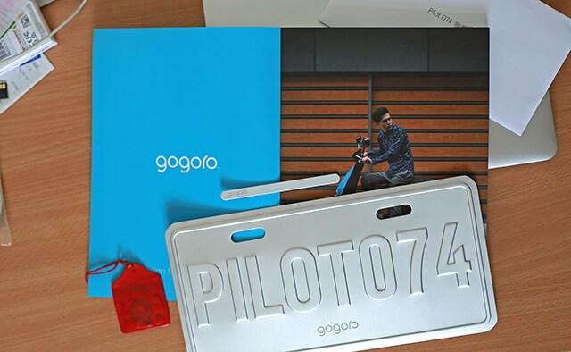
▲PLIOT 074 / 20150624 – 20150820
About the Writer
Design Tongue / Jeremy Lin
Design Tongue is a content platform focusing on user experience issues, including UI, interactive design, user experience, product design trends, and service designs in an attempt to enable the readers insights into the designer’s mind and promote design thinking.