
“Oh man! What the hell is this? Why is it so hard to use?”
Does it sound familiar to you? Has it occurred to you that the things we use every day, from the moment you open your eyes until you go to bed, influence your mood due to bad user experience? Or even products of the same functions, some make you feel heart-warming, while others are just hopelessly bad. In fact, many details of our lives are closely related to user experience (UX). If the designer can be more empathetic to the users, lots of unhappy experience can be prevented; the world can even become a better place!

The author will share what he/she normally does on a day on weekends to help you discover the user experiences in daily lives

▲Photo source: Traditional alarms vs. iPhone Bedtime
08:00 am
In the morning, parlor music with beautiful chords rings beside your bed. You slowly open my eyes and see the sunlight on the floor in front of your window, listening to the birds sing in the trees, and knowing that you are ready to start a new day with a pleasant mood; or, let the “ring ring, ring ring, ring ring,” nearly deafens your ears, the sunlight is too harsh, sparrows too noisy, making you annoyed from the first second you wake up…That’s right. A simple alarm sound decides your mood in the rest of the day! Traditional alarms aim to wake you up in the morning as soon as possible, while a good alarm design. such as the “Bedtime” function on iPhone iOS 10, use parlor music from soft to loud to wake you up and record your sleeping time; more over, it can also remind you when you should go to bed every night to ensure you have enough sleeping time. This sets a very good example of user experience in our daily lives, a really good design that cares its users’ perception.

▲Photo source: Traditional remote control vs. Apple TV remote control
08:30 am
Pick up the remote control to watch the news. Turn on the TV, pick a channel, adjust the volume. I can’t help but ask, which keys do you actually use when you use the remote control? Power, channel up, channel down, volume up, volume down… what else? Most remote controls are with glamorous design where all functions are on the interface, but actually a user only uses the most basic functions, in which case the more complicated design isn’t equal to a better design. On the contrary, on the Apple TV remote control, only key functions are embedded. It’s smaller and easier to grasp and pick up, and also easier for use.
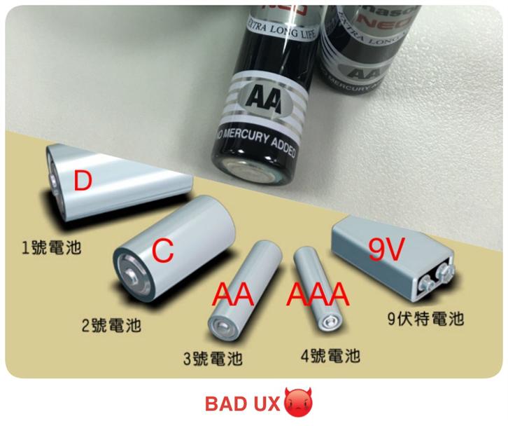
▲Photo source: Battery sizes
10:00 am
You press, then press, but the remote control just doesn’t function. You suppose the battery is empty. You open the battery lid to change the battery, but at first you see 2 As. Does it mean a size 2 battery? Wrong! AA means a Size No. 3 battery! AAA means Size No. 4 battery, do you think Size A is Size No. 2? Wrong! Size No. 2 is actually Size C… Oh my, what a series of complicated battery sizes! But do you think the battery sizes are the same in every country? Wrong! The No. 3 battery in Taiwan is a NO. 5 in China; a No. 4 in Taiwan is a No. 7 in China… You wonder why it is so hard to link the sizes to the batteries, and why even countries speaking the same language — Mandarin — use different size specifications…
A better example would be the sizes of clothes: S, M, L, XL. S=SMALL, M=MEDIUM, L=LARGE, XL=EXTRA LARGE. There is an obvious link between the dimensions of the clothes and the size letters, and therefore it’s easier to memorize and you won’t be mistaken.
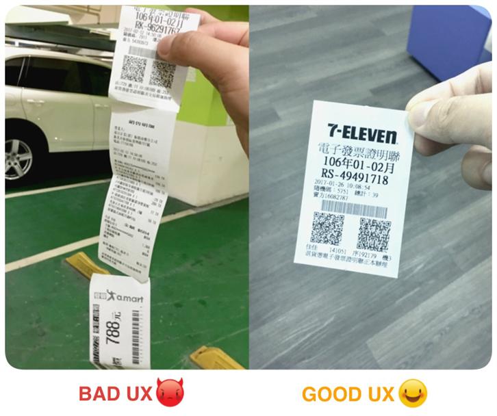
▲Photo source: Receipt from a wholesaler vs. Receipt from a convenience store
12:00 am
You go to a wholesaler to buy some groceries and batteries as well, but when you are at the counter, do you think you get one piece of receipt? Wrong! You have a scroll of receipts which seems endless… Are you kidding me? Why do you give me so many coupons that I won’t use. I don’t need them at all! Can’t these wholesalers just give me one simple receipt?
Our government promotes use of electronic receipts with the good intention to minimize the use of paper, but, without a well-planned relevant supplementary policy, the transaction details are sometimes a lot longer than the original receipt; some stores even attach more discount paper and coupons, not only making it even less eco-friendly but also a user-unfriendly design.

▲Photo source: Door at a restaurant in Banqiao vs. Door at a company in Taipei
01:00 pm
During lunch, you find this door special. Each wing of the same door says differently: PUSH and PULL, respectively, but the door handles are in the same design. Normally people are stuck here: Why is this side PULL, the other PUSH? A great design should have suitable “affordances”, which means when people see the appearance of this object, they should be able to use it intuitively, rather than being forced to suit the object, because doing so will only make you more unpleasant when using it.

▲Photo source: Parking lot at a square vs. Parking lot in Taipei City Hall

▲Photo source: Parking lot in Taoyuan Bade Ambassador
03:00 pm
Let’s drive to a cinema for a movie. Finding a parking space is always problematic for some people. A traditional parking lot is like a maze, where you cannot find a parking space and, even worse, get lost. A more thoughtful parking lot design tells you if a space is available through red/green lights so that you can see it from a distance. When you get off your car, you see the pillars distinguishing areas by color and numbers, so that you won’t forget where you park your vehicle!

▲Photo source: A movie theater vs. Keelung Showtime Cinema
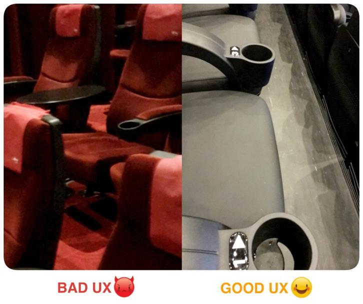
▲Photo source: A movie theater vs. Bade Ambassador Theater
04:00 am
Have you ever had this experience: When you enter a movie theater to find your seat, you have to spend a thousand years looking for your number; what’s worse, it’s embarrassing that you might take the wrong seat. Lots of movie theaters write down the tiny little seat number at the back of the seat. Why, do they refuse to let people see the number? When you enter the cinema from the first row, it is difficult to identify the number and easy to take a wrong seat. A better theater seat design should write down the seat number big and clear on the back of the seat, leaving you no chance to miss it. Some cinemas even indicate your seat number and direction on the armrests, which prevents you from taking a wrong seat, and, even better, you don’t have to compete with the stranger sitting next to you in who should use which cup holder on the armrest.
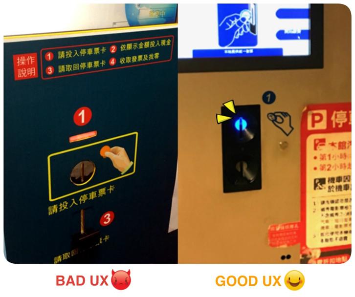
▲Photo source: A parking lot vs. Parking lot in Banqiao Mega City
06:00 pm
After the movie, you have to pay the parking fee before leaving, but this kind of parking lot payment machine leaves you speechless. Normally, parking lots and the payment machines are in basement, where it is darker, so there is often lights telling you where the hole to toss the payment coin is. The photo on the left above has a complicated panel design, with a “flashing” indicator above the coin hole, various numbers on the screen, and a coin hole marked by a yellow box… In comparison, the machine on the right indicates where to toss the coin with an illuminating point. It’s easy and clean!
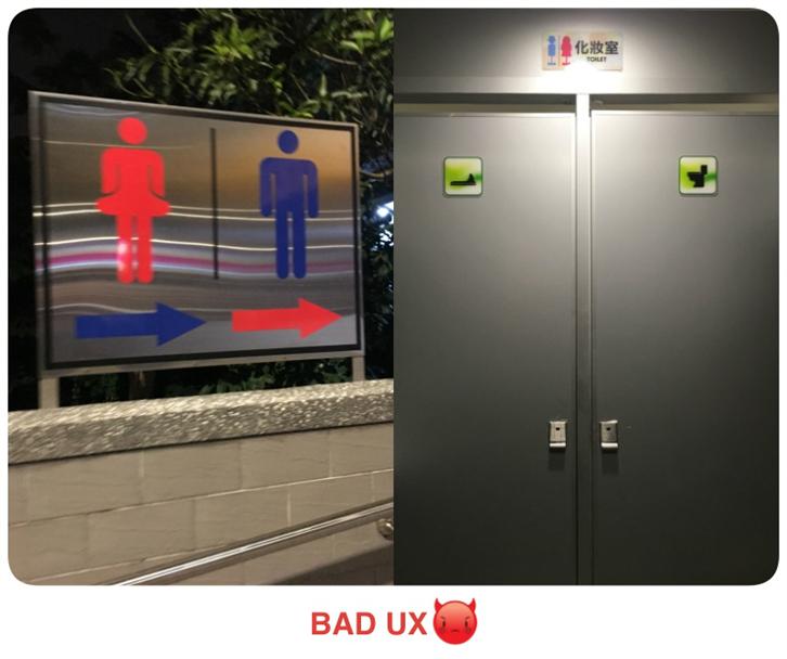
▲Photo source: A restaurant restroom
07:00 pm
Go to the restroom before dinner. Most of the time, we only need a simple direction rather than confusing toilet marks… As shown on the above left, normally, the lady’s room will use red, and men’s room use blue. But why does the arrow below use a different color? And was shown on the above right, there are only two restrooms, one squat toilet, one sitting toilet. But then the above indicators separate men and women. Doe it mean, in this restroom, men can only use squat toilet and women can only use the sitting one? Or is this restroom very progressive and allows men and women to use the same toilet? And why aren’t there any urinals?
▲Photo: A restroom in an art museum in Paris
It reminds me of the toilet I saw in an art museum in Paris. From this artistic restroom indication, can you tell which one is for men, and which one for women? (I still can’t tell even now…)
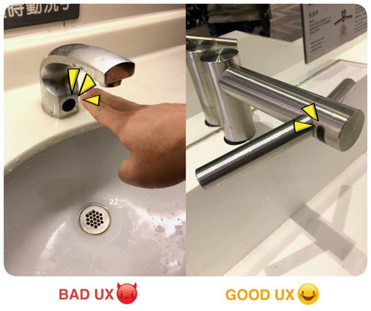
▲Photo source: Restroom in a cinema vs. Taipei 101 Food Court
The biggest tragedy comes now. After toilet, you need to wash your hands, but no matter which angle you put your hands, water just won’t flow out from the faucet. All you can do is to quietly shout to yourself, “Why? Am I not Human? Is it my fault that the water won’t come out?” Believe me, it’s definitely not your fault. If your hands cannot be detected, it’s the faucet’s fault! Because when a product is poorly designed, it’s not the user’s fault, but the product’s! (comforting shoulder pat)
Design changes experiences, experiences change design
Design and experience are closely related. A good product design shouldn’t force you to adapt to it, but think from the user’s point of view and solve the problems and feelings occurred during the user’s interactions with the product. As Don Norman said, “If you want people to use something, you have to make sure they can easily perceive, understand and interpret what this is, and make sure they know how to use it.” This is what UX design does, to stand at the user’s side, to incorporate a user’s empathy, feel what the user feels, improve the user’s experiences. When each one of us pays more attention and thinks a bit more for the user, actually everyone can be an everyday UX expert.
Author: Elan
This article is provided by PIXNET UX Lab, original article from Behold, UX is all around! User experiences in our daily lives
Through sharing user experience research and design related reflections and outcome reports, PIXNET UX Lab Team dedicate UX related experiences to communities to enhance the development of UX related expertise in Taiwan.