
In the information era of high mobility, people demand not only convenience of information accessibility but also its availability, for example, you may download any application you want on your phone or take an interesting picture and upload the photo to Facebook to share with your friends. When we enjoy the convenience and information that technology brings through any device, we do it through “UI”.
What is UI(User Interface)?
Actually UI is all around us, any interface that assists the interaction between a person and an item or between people is considered an UI, which includes icons, signs, sounds and gestures etc. For example, you will stop when you see the red light on the street, you will know if your credit value is running out through the sound feedback from the metro card machine.
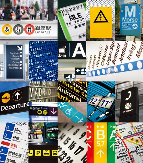
▲UI is all around us!
What’s the importance of UI design?
There are many things in life that because of their friendly, intuitively UI design, you will know how to use them without learning it. For example, the big and small loop on the scissors handle, you know how to use it when you see it: you put one finger in the smaller loop and other fingers in the bigger loop. It’s very easy to use.
With the advancement of technology, it’s not hard to imagine how information will evolved into a much more complicated state in the next 5-10 years. By then, people may not need to acquire information through any device, for example, you could touch the window with your finger and the window will instantly show the current temperature and precipitation rate. Such convenient and useful information will gradually become the trend, everything will revolves and evolves around people’s lives to make UI as easy as using a scissors. The usability and interaction attributes of UI play a key role in accessing and understanding information.
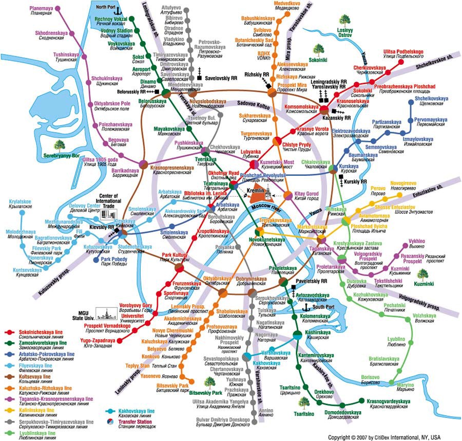
▲Moscow metro has the second highest using rate in terms of underground transit system, only next to Tokyo. The above illustration is its metro map before the reformation, you can see the underground and aboveground routes overlap with one another. People could get disoriented just by looking at the map.
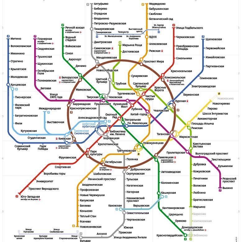
Russian design company, Art. Lebedev Studio was commissioned to design the new Moscow Metro Map
1. firstly, all the routes were realigned to straight lines.
2. Turns on each line were smoothed out to create a more well-rounded visual presentation
3. All the irregular lines were arranged into circles to simply the shape.
4. In the overall route map, the routes were drawn on top of grid lines and marked with vertical and horizontal serial number for easy distinction and stop positioning.
Doesn’t the metro map seem so much more user-friendly after the reformation?
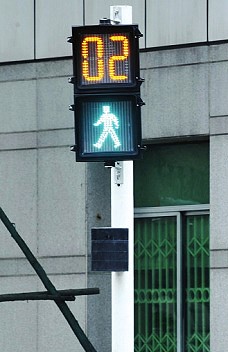
▲Nowadays the traffic lights were added with countdown timer and voice function to improve the convenience for visually impaired people.
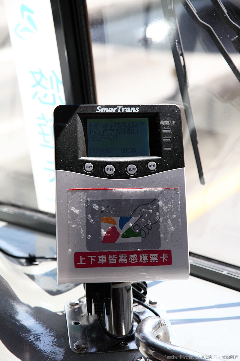
▲The metro card sensor will let you know if the credit deduction is successful or you’re running out of credit.
To enhance the municipal scenery, reduce bus signs and improve on the readability of bus routes, Taipei Public Transportation Office and Taipei Joint bus Management Committee work together to create new bus stops.
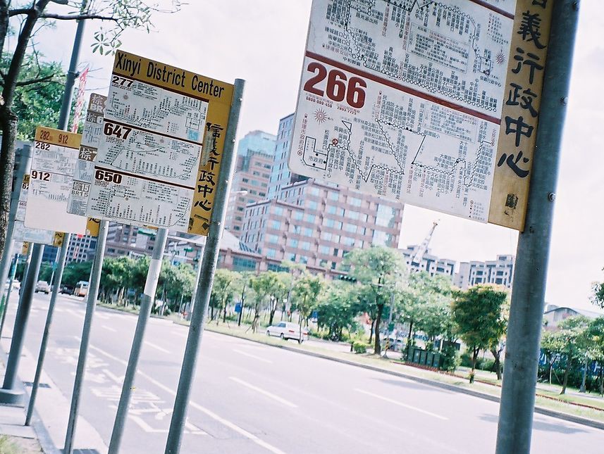
Old Bus Stops
In addition to the route map, there were also heavily-cramped words. The layout was not user-friendly for people with bad eyesight or shorter height. One bus stop area may have several bus routes pass by, so people have to go from stop to stop to find the route they want. The old bus stop also took up much sidewalk space.
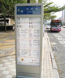
Centralized Bus Stop
1. Increase the routes in one content, so the passengers don’t have to go from stop to stop to find the right route.
2. Reduce the height of the stop to decrease the inconvenience.
3. Adopt stainless steel as the material to enhance the overall look, eliminating the annoying ads.
Dizzy illustration stuffed with words and data was transformed to accessible and reader friendly format through creative design. Doesn’t it showcase the theme better?
UI and Life Goes Hand in Hand
Information could be lost or missed due to bad design or miscommunication, which could in turn impede our lives or works and cost us a valuable client or cause a serious accident. These problems will occur as long as there are bad designs. So, how important do you think UI design mean to us? The answer is: substantially!
————-
About Author
Gamania UI Design Center
Focus on User-Centered Design (UCD) and apply it on respective projects across the group for improvement. UCD is adopted to propel and provide the best user experience of Gamania self-produced products.
————–