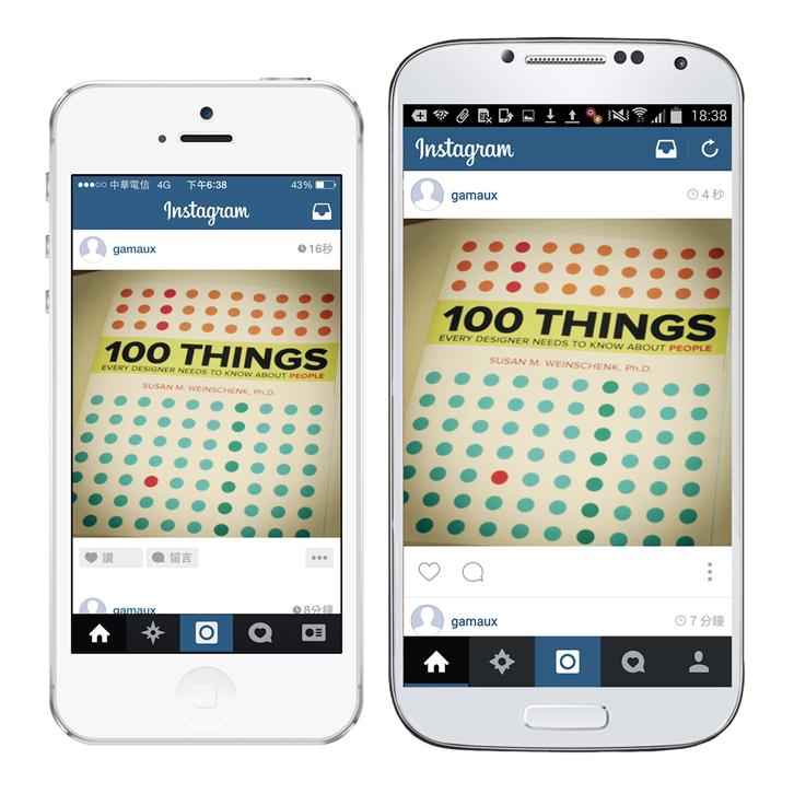
Recently, many people have decided to transfer their iOS or Android platform app onto the other respective platform after development, in hopes that more Apple or Android fans would share these apps’ services. However, development teams can face major challenges when implementing cross-platform development and design. This includes different hardware, software, screen resolution, and user interfaces. Though we cannot alter the iOS or Android software or hardware specifications, we can devote extra energy in the interface and operation experience so that all Apple and Android fans may enjoy an excellent usage experience.
The next cross-platform app design cases will demonstrate how these apps have provided fulfilling usages experiences for both Apple and Android fans.
Learning the Design Specifications of Different Platforms before Production will Enhance App Usability
While designing an app, one must take the usage habits of most users into consideration so that users learn to navigate this app quickly and become willing to use it. Different platforms have different operational and design specifications. If you don’t have the time or budget to conduct user operation behavior studies, you could start with the official design guidelines released by each platform.
Take the “back” function for example; there is an obvious back button at the upper left corner of the iOS browsing menu. This is used to go back in apps.
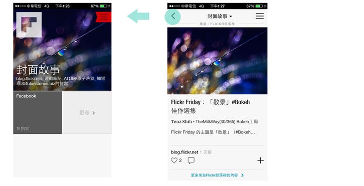
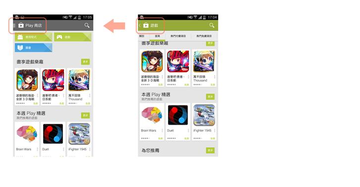
However, there are two ways to go back in the Android platform: (1) Use the back button shown on the upper left corner of the interface; (2) Press the back button on the mobile phone, which will return you to the home screen.
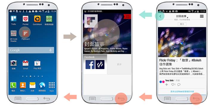
Though Android mobile phones are very flexible during operation, one can easily end up at the home screen unintentionally if the back button is pressed under at any time. This is why Android apps integrate guiding prompts into their interfaces to reduce the frequency of unexpected visits to the home screen.
Maintain Consistency Throughout the Operational Process Experience to Minimize Try and Error for Users
Users are unwilling to learn two ways to operate the same product. If they spend too much time learning to use the app and continue to encounter bottlenecks, they may easily end up just deleting the app.
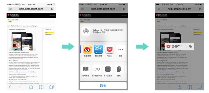
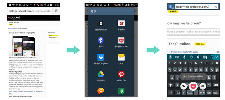
Take Pocket for example. It provides the most consistency in terms of visual layout, operation process, and dynamic presentation throughout iOS and Android cross-platform designs. It takes only 3 steps in either iOS or Android to make a new entry on Pocket! (1) Open up a website, (2) Activate the share function, (3) Select share to Pocket.
iOS – Steps to Create a New Entry
Android – Steps to Create New Entry
Apply Good Functions by Expanding Their Application to Other Platforms!
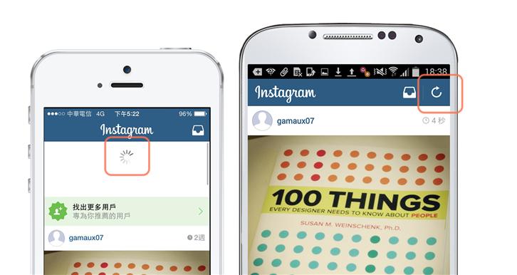
As different platforms naturally have different development tools, programming languages, and structures, some functions may be presented or used in different ways. Take the refresh function for example. Pulling down to refresh is built into newer versions of iOS. However, the pull down to refresh function is time and cost consuming to recreate on the Android platform, so it is usually replaced with a refresh button.
However, if a good function would greatly increase user satisfaction, why not break free from the limitations of a certain platform and expand its use to another platform? Facebook broke free from the manual refresh function of the Android platform to apply pull down to refresh functionality in both the iOS and Android platforms so that users on either platform share the same convenient experience which allows easy viewing of the latest statuses.

Cross-platform design and development is a major undertaking which requires in-depth understanding of usage habits by users on different operation systems, proper utilization of the characteristics of different platforms, and breakthroughs in platform interface and operational limitations in order to bring users smooth operational experiences on different platforms.
Author Information
UI Design Center / T-T Yang
Implements or improves various projects through User-Centered Design methods, dedicated to promoting the best user experience in products.
