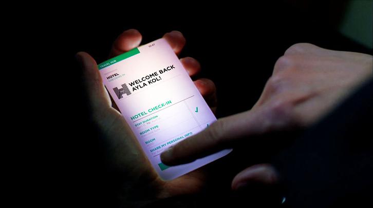
First, perish that thought. It is important to have a good-looking interface design but ease of use takes priority over good looks. In pure graphic design, there is no need to consider human “interaction”. In interface design, however, the concept of “interaction” must be incorporated. It must respond and give feedback to all user operations, and optimize the software’s usability within the constraints of the hardware. How to achieve the perfect balance between the visuals and performance is what keeps interface designers up at night.
So what is good Interactive interface design?
In the book Designing for Interaction, it mentions 7 key points to good interactive interface design:
1. Can be trusted
Take Google Maps and Apple Maps for example. In iOS7, Apple adopted a map it designed and developed itself. Apple Maps looked better but it often misled the user and took them to god knows where. No matter how good it looked, it made people distrust it. That’s why people generally stuck with Google Maps, an established product with high precision.

▲ Google Maps on the left, Apple Maps on the right.
2. Appropriate
The CNN website for example changes how it works and its layout based on each country’s culture, social conditions and even politics. This eliminates the burden of adaptation for users from different backgrounds (English-speaking countries for example read from left to right, Arabic-speaking countries read from right to left. For two countries with completely opposite ways of reading and writing, the design and layout of the website will be different as well)


▲ CNN’s English edition on the left, CNN’s Arabic edition on the right
3. Smart
When using conventional USB connectors, there’s a 50% chance that it is inserted the wrong way. The iPhone 5 charger port and connector fixes this problem. Simply put, it is fool-proofed against user error.
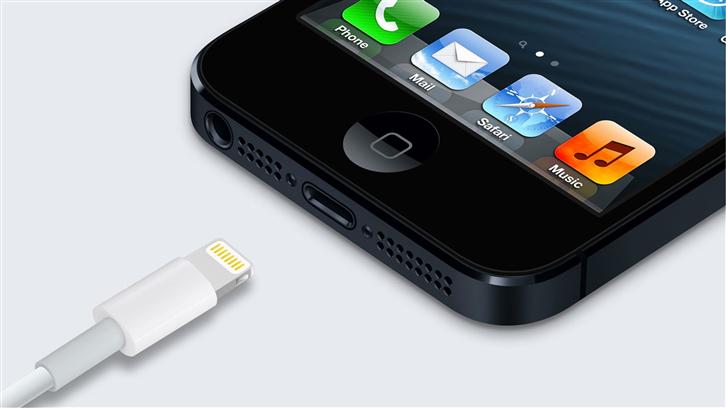
▲ The iPhone5 improved charger connector and charger port.
4. Responsive
In other words, avoid delays that cause user impatience. If we start an application program but it stays suck at the start-up screen with no progress bar, this makes the user impatient. It also reduces trust, willingness to use, and makes you wonder if the program has crashed. In some circumstances, provide the user with suitable response and feedback to let them know what’s happening or reduce their impatience.
5. Refined
Here it means putting yourself in the user’s boots on the details. For example, when we are using a new app we must not only fill in the required fields (e.g. e-mail, name, phone number) but a slew of membership details as well. Are these details absolutely necessary? We may want to consider putting these optional fields on the second layer or skipping them for now. Think about it. When you see a registration page with a ton of fields to fill out, don’t you just want to back out right there?
6. Interesting
People are more attracted to the fresh and interesting. Adding some fun elements can attract the user’s curiosity as well as increase the odds of being used and stickiness. It will certainly be more likely to liked and promoted than plain, boring applications. LINE Rangers, for example, allows the player to interact with in-game characters at the Loading screen. Apart from replacing the usual sand timer or spiral with a cute animated character, clicking on the character makes it fall over or attack. The player is not bored while waiting.


▲ LINE Rangers loading screen
7. Pleasantness
People like to use things that feel pleasant. Everyone wants to use an app that makes them feel happy. The key to making users feel happy includes not only the functions and design aesthetics but also to eliminate pressure and unpleasantness when the user is using the app. If there are no operating difficulties or hiccups, smooth operations will increase user satisfaction.
Apart from the 7 above points, visuals and audio are also areas where interactive interface design can be enhanced. Users have always depended on their five senses and for those living in the age of information explosion, the senses of vision and hearing are particularly important. By using graphics, sound (e.g. sound effects or voiceover) and dynamic images, the interface can be imbued with two or more media formats to form a multimedia user interface. The introduction of dynamic, musical, sound effect or image elements can also enhance user acceptance of information. In RPG games for example, the addition of striking effects and sounds when fighting monsters enhances the fun of the game through sight and sound.
▲ Super Robot Wars is famed for classic characters as well as its fancy yet stylish combat. It is displayed through a multimedia interface and provides players with information.
Does your product feel like it lacks a little something? Put more effort into interaction design and give your product extra marks!
Reference: http://goo.gl/XS29D7
